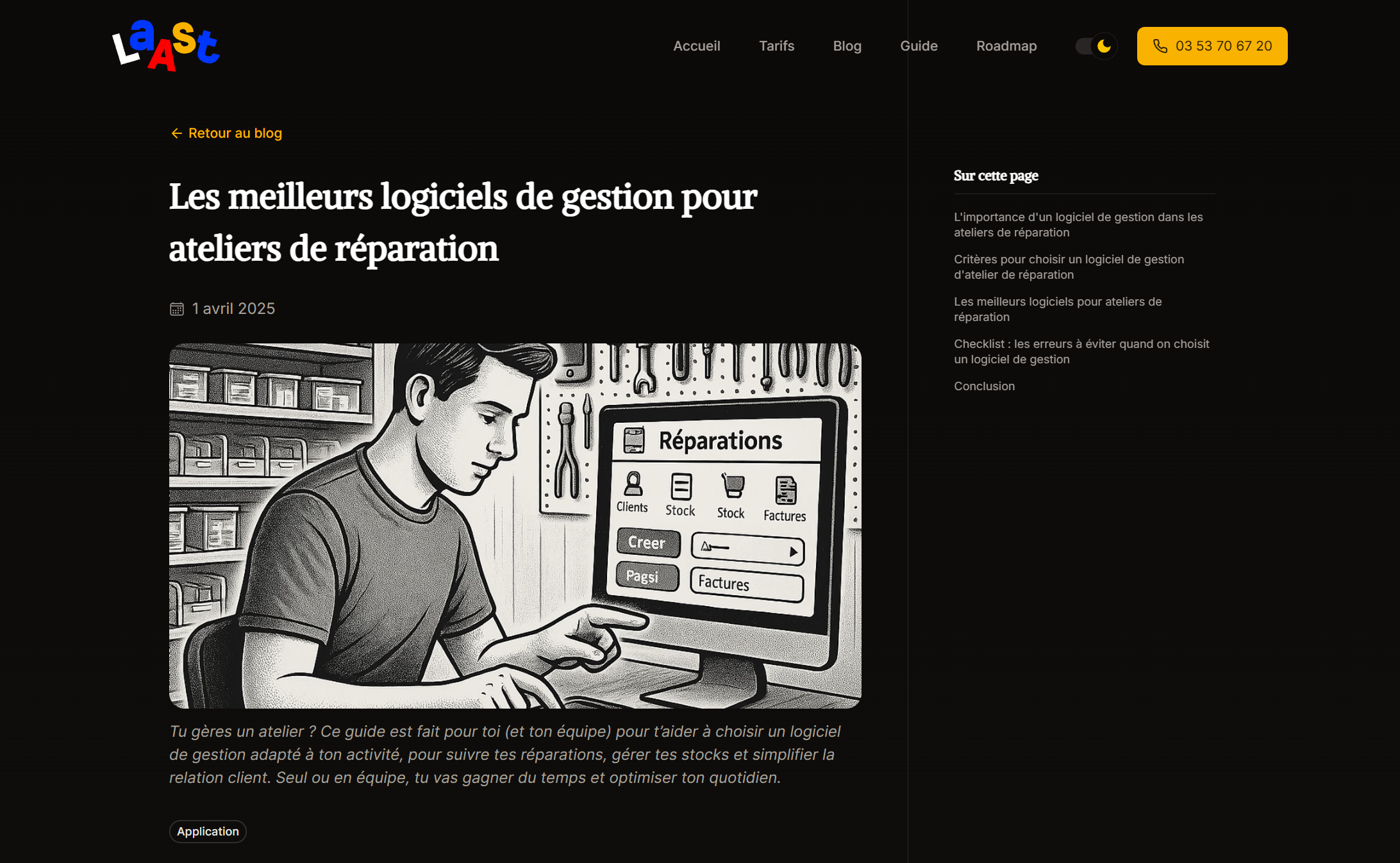
I redesigned and coded the Laast.io website — a repair shop management software
Laast.io is a unified platform to boost repair activities. It helps manage the challenges faced by repairers daily, including task tracking, inventory, customers, and billing.
Taking over the existing website
In a previous case study, I got you through my journey with the Laast.io web application for repair shops. The client was pretty satisfied with the UI design and the UI code integration work that I’ve done for him on the Laast application.
He had a marketing website done with another team but ended up pretty unsatisfied with it after running it for a few weeks. The new website, like the first one, would have to emphasize the branding and make the best of it, but should also, unlike the first one, focus on the product and its benefits to drive more conversions as well as improve Laast.io’s online presence and brand identity.
Personas and competitive research
For this project, the fact that I already did the research for the app project obviously helped me. I simply went from the same personas and the same competitive analysis, analysing their marketing websites instead of the actual apps. While the Laast.io web application has been tailored for reparators and customers, the marketing websites solely focuses on reparators, aiming at signing them up and onboarding them into the web application.
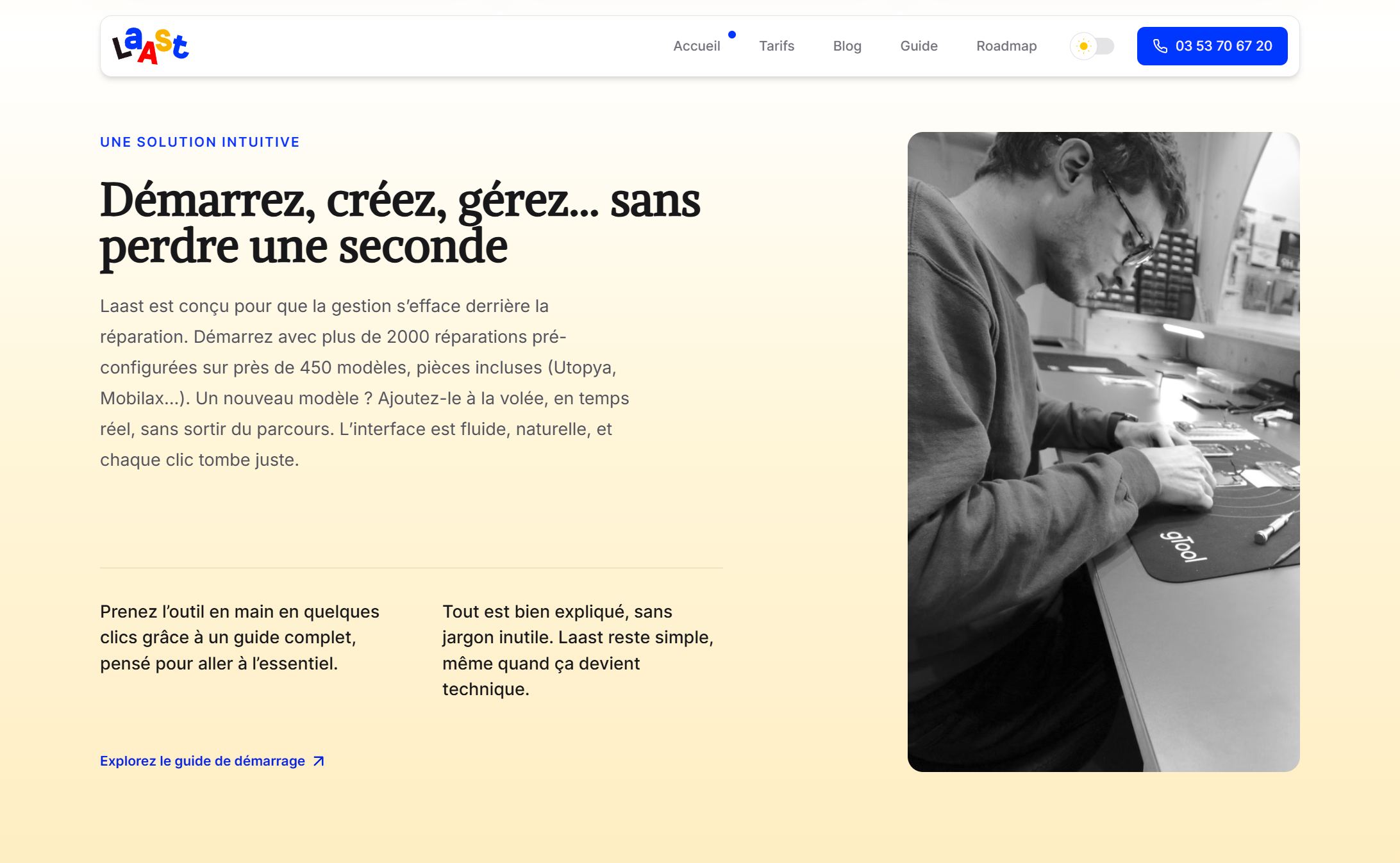
Designing the landing page layout
Like the previous project, the client asked to skip the Figma design phase, to save up on budget and allow as many revisions as possible for the website code. Aiming at fairly young segment on the market, we agreed with the client to go for a playful and colorful design, and to stay inline with the brand.

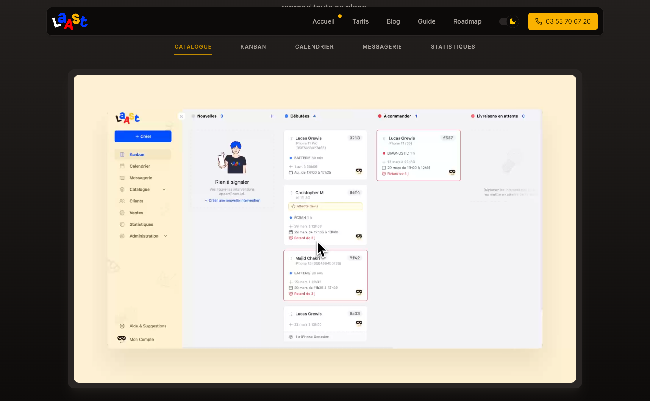
Mobile first with a focus on usability and accessibility.
Of course the website has been designed with mobile first in mind, focusing on usability and accessibility. The landing page includes 6 sections that focus on the essentials, aiming to convey a strong message to boost conversions.
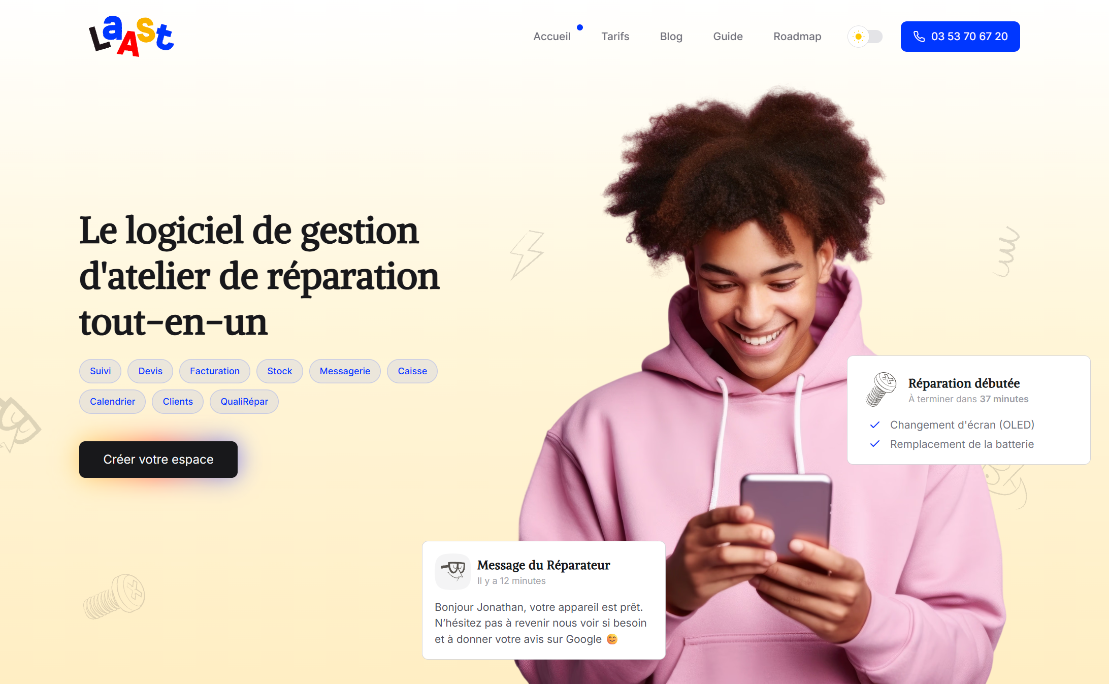
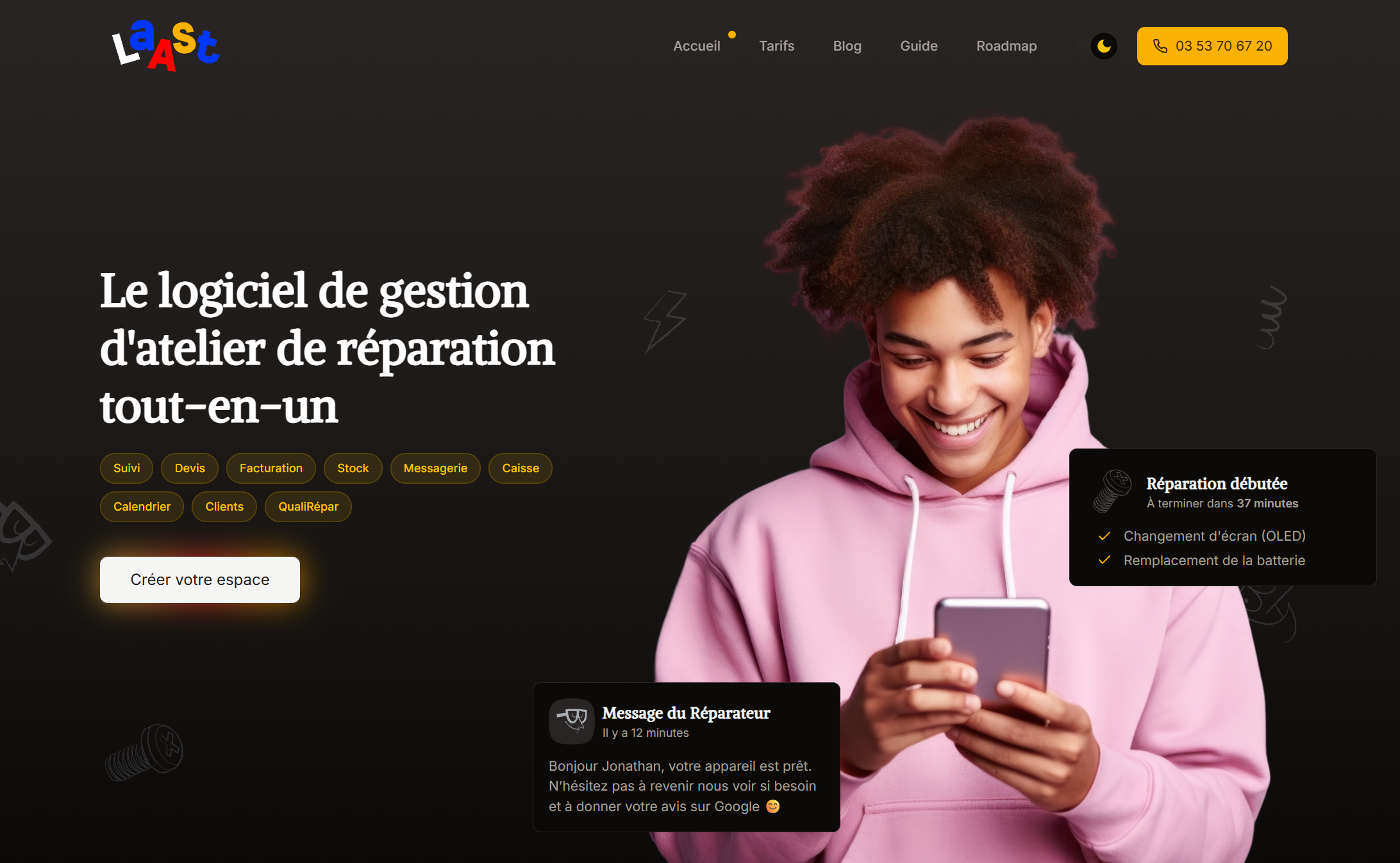
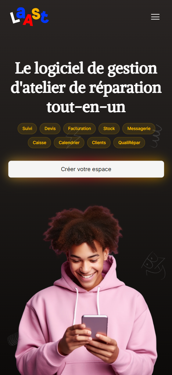
1/ Hero section
The section showcases an image of a happy character, to which customers can relate, holding a phone, strongly suggesting satisfaction regarding the service. Some branding elements are also present, such as the logo and the illustration style, which is consistent with the brand identity.
The hero section conveys a strong message.
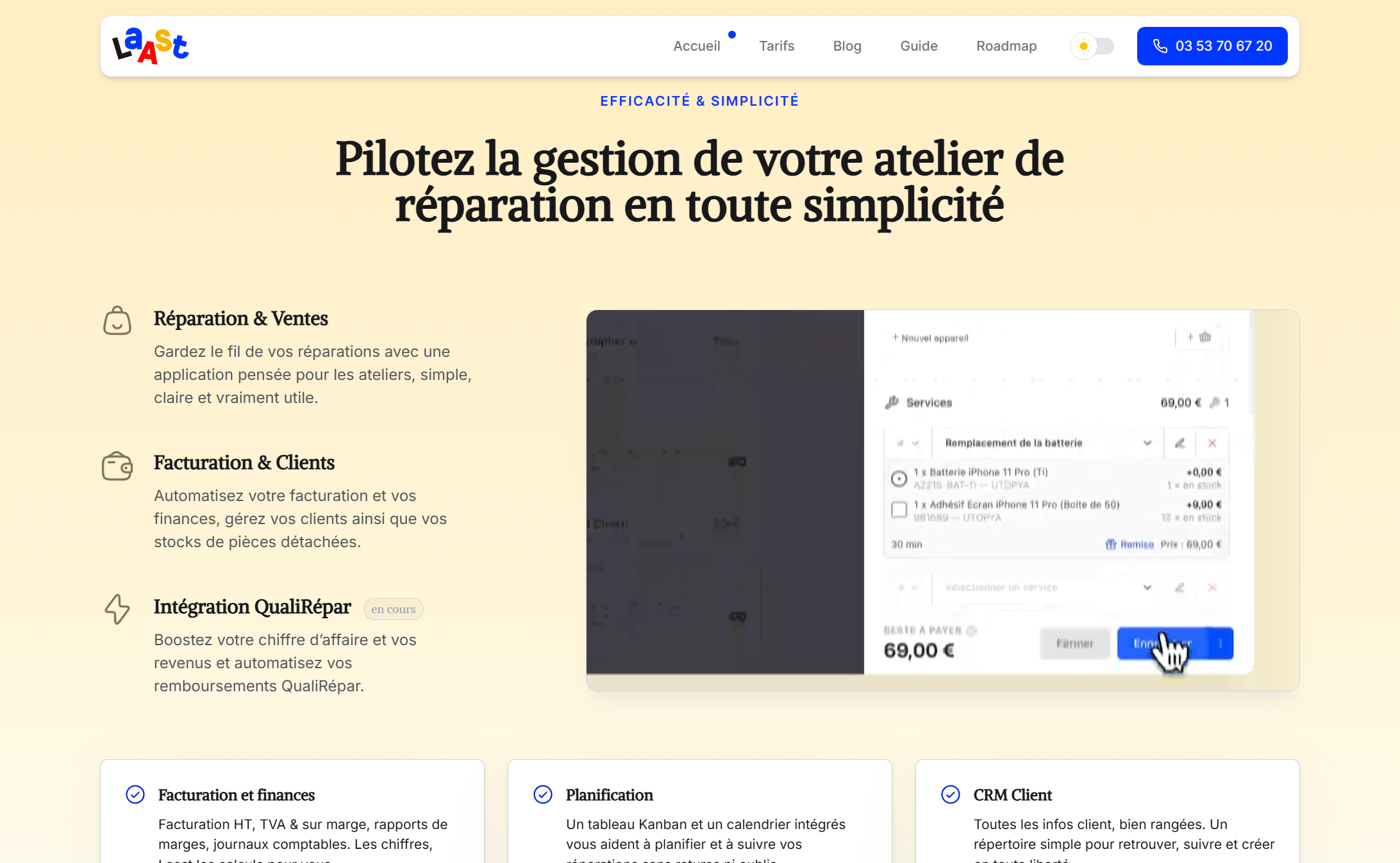
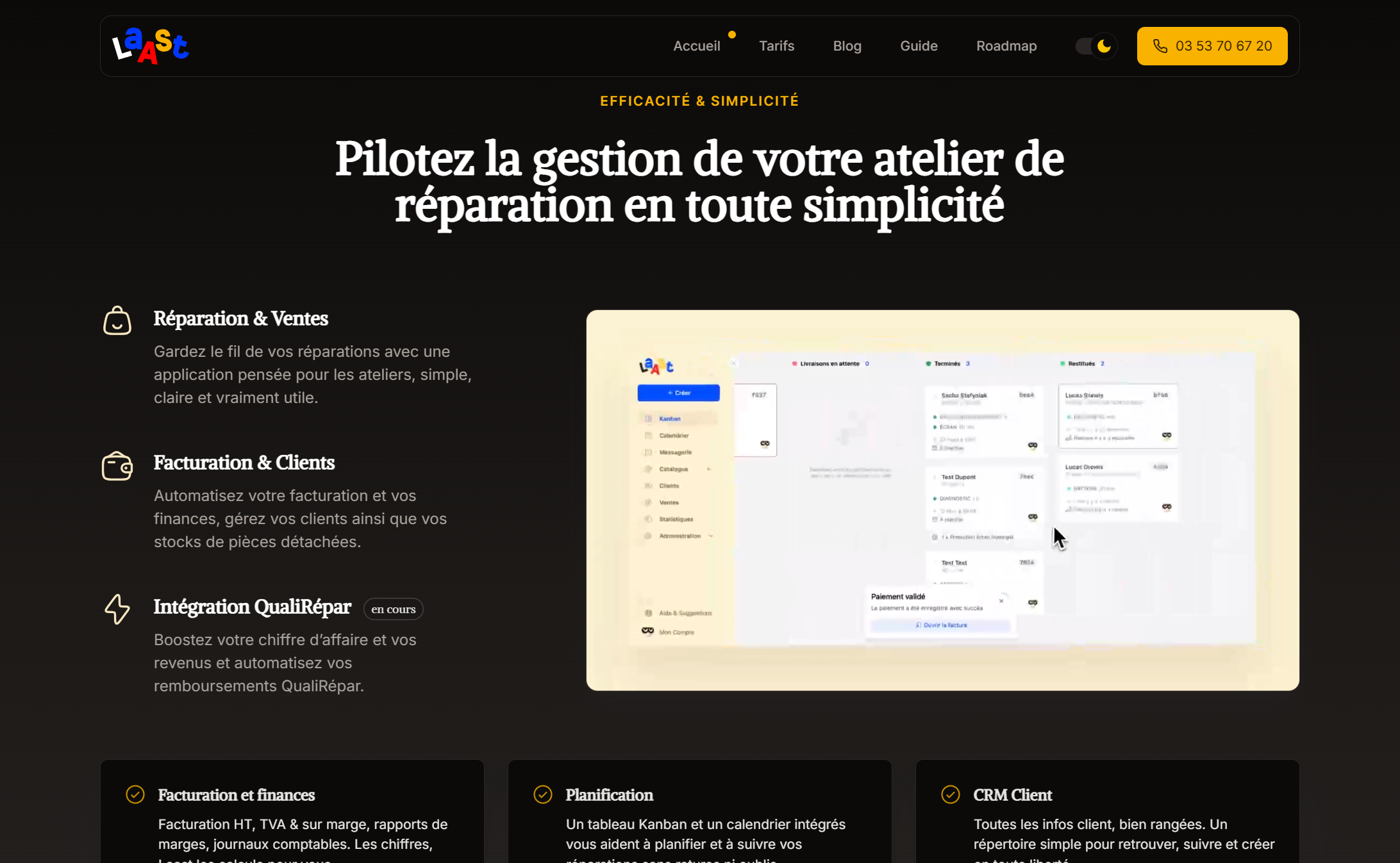
2/ Features section
This section is helped by a few icons, describes all the major and less important features that the product has to offer. A screencast shows the product in action, giving a better understanding of its benefits.
The features details all available features.
3/ App UI section
This section showcases the application interface, highlighting its user-friendly design and functionality. It includes video demos that gives a quick overview of the app's capabilities.
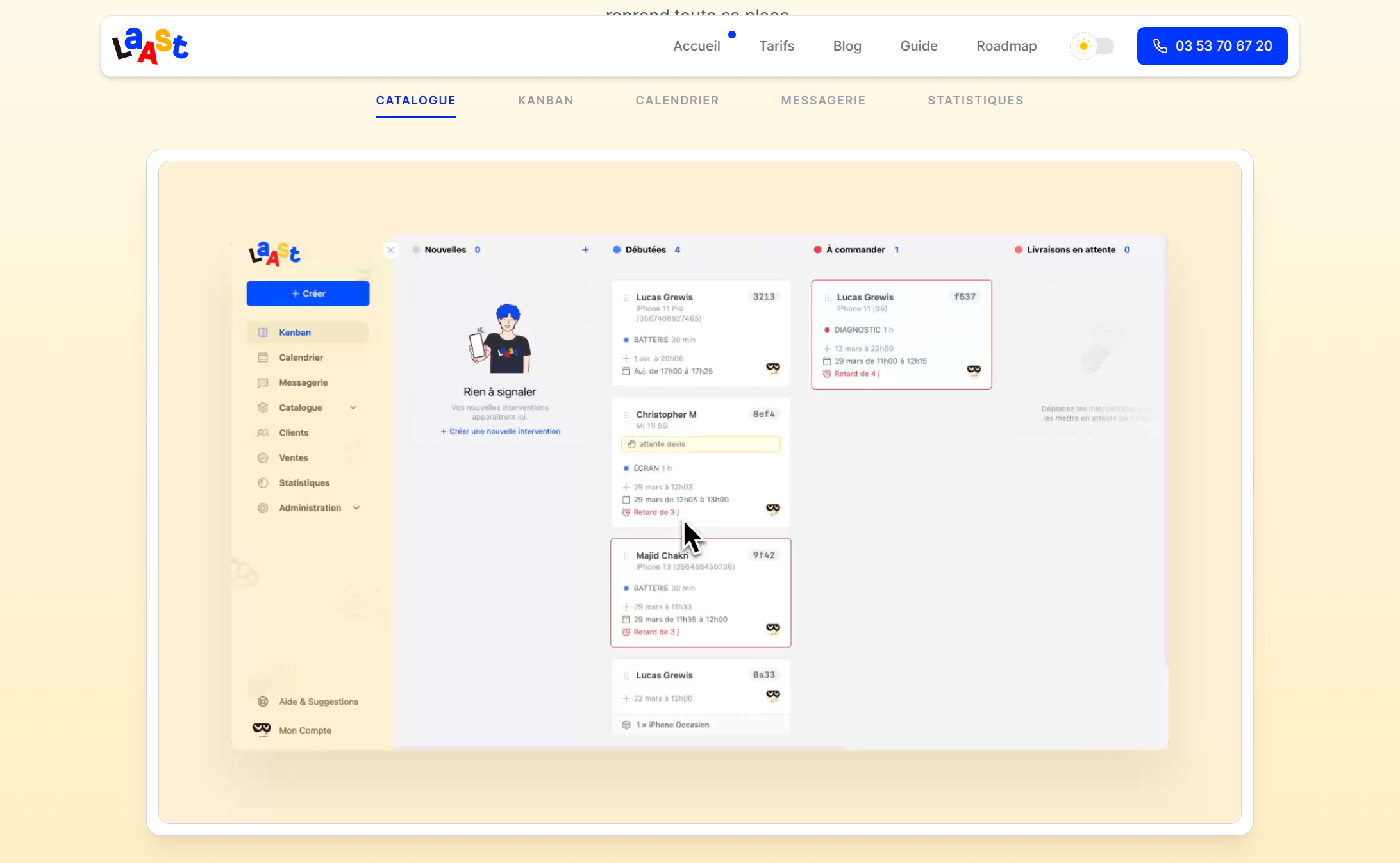
The app UI section highlights the user-friendly design.
4/ Bento grid
section focusing on diving deeper into the features, as well as acting as a certification of quality and a customer reassurance element.
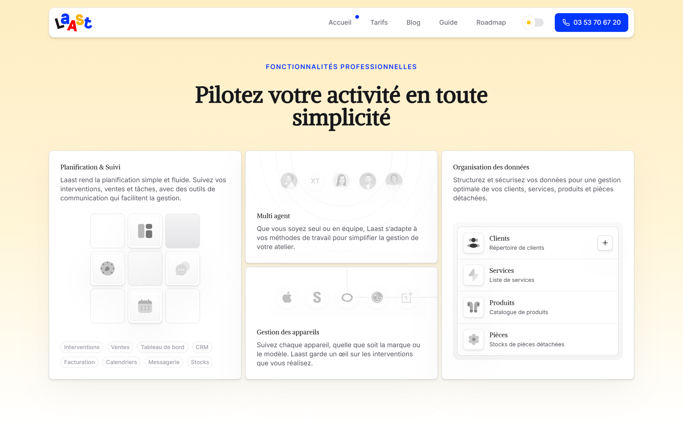
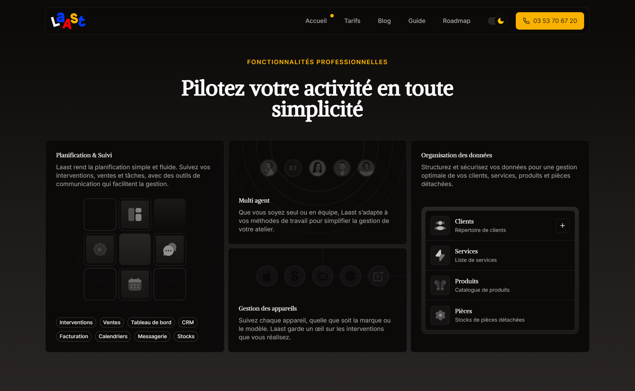
The bento grid section dives deeper into the features.
5/ Onboarding section
This section explains the app basics and redirecting to the guide section of the website. It aims to reassure potential users about the ease of getting started with the app.
The onboarding section acts as a reassurance element.
6/ Pricing section
The pricing section is compact and straightforward, providing a clear overview of the available plans. It includes a call to action button that encourages users to sign up for the service.
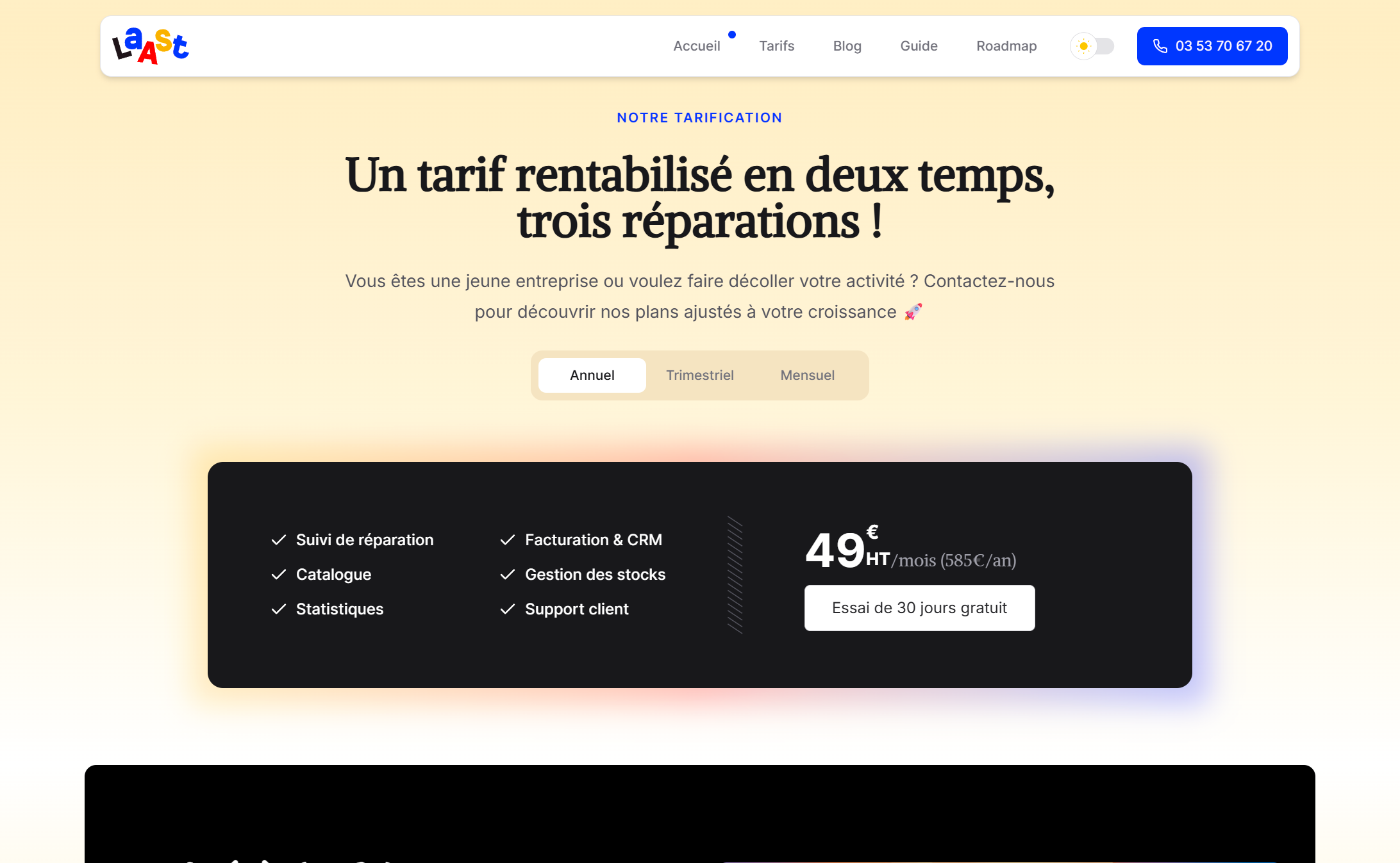
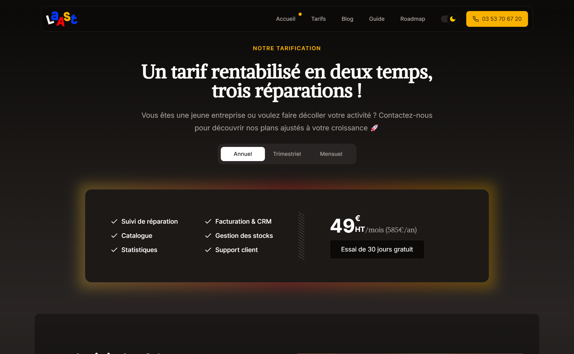
The pricing section is compact and straightforward.
A traditional structure, but that has prooved many times its effectiveness on customers, as long as there is not too much content.
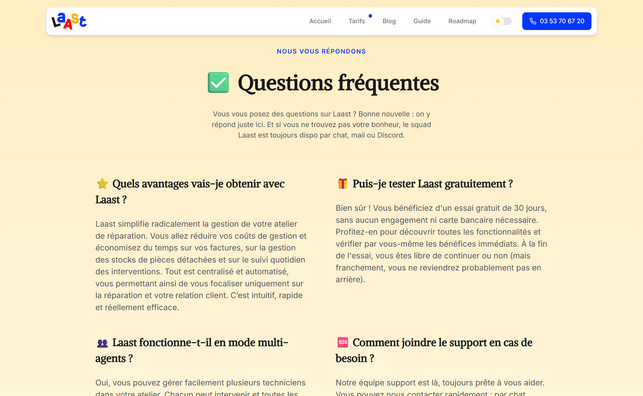
Taking care of the pricing page
The pricing page remains simple and expands on the compact pricing section of the landing page, adding a list of the product features.
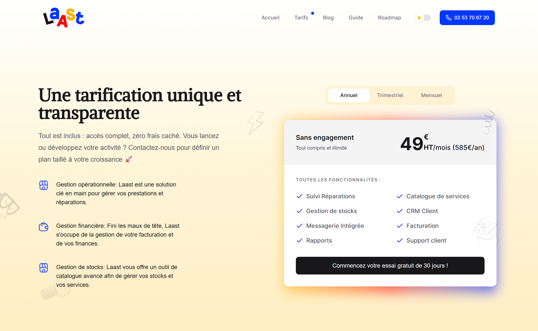
The pricing section is compact and straightforward.
The page also provides a testimonials section, built upon texts sent by repair shop owners. Cards are rotated in a funny way to give a playful aspect to the page, while still being readable and accessible.
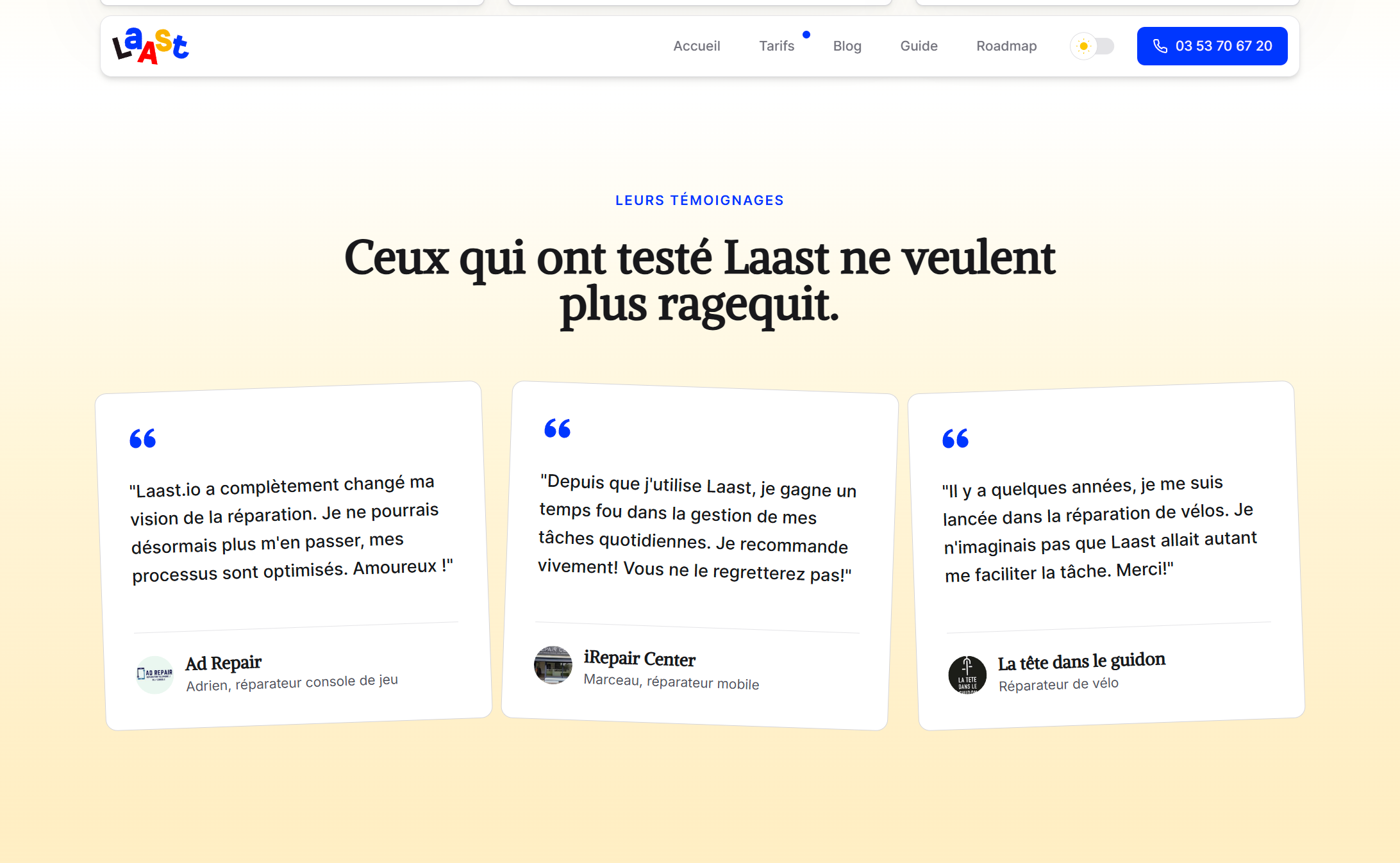
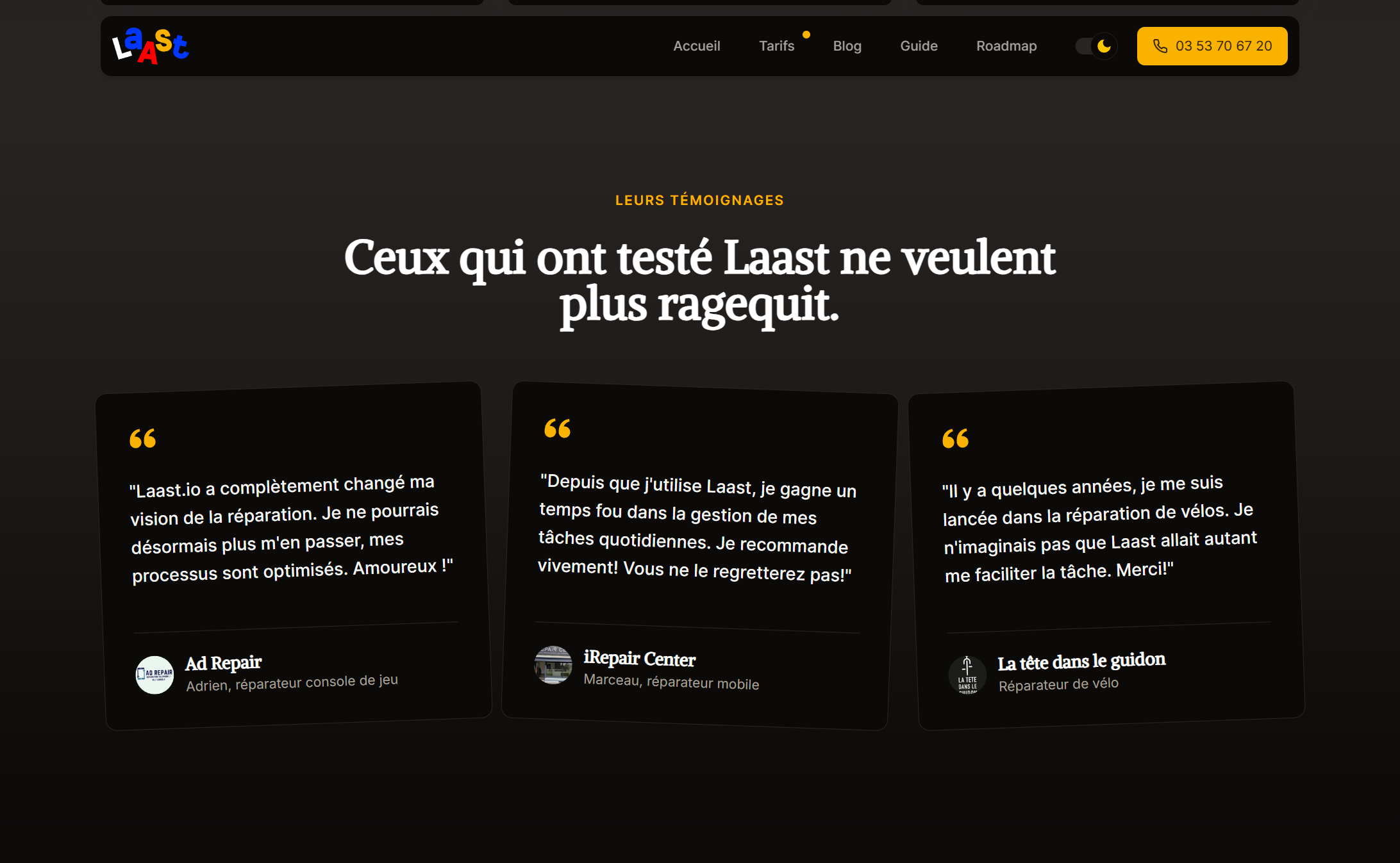
Testimonials and FAQ are a great way to build trust.
A FAQ section wraps the page and provides answers to all the basic questions a customer might ask. Since the customer base has constantly been growing since launch, the FAQs are regularly updated.
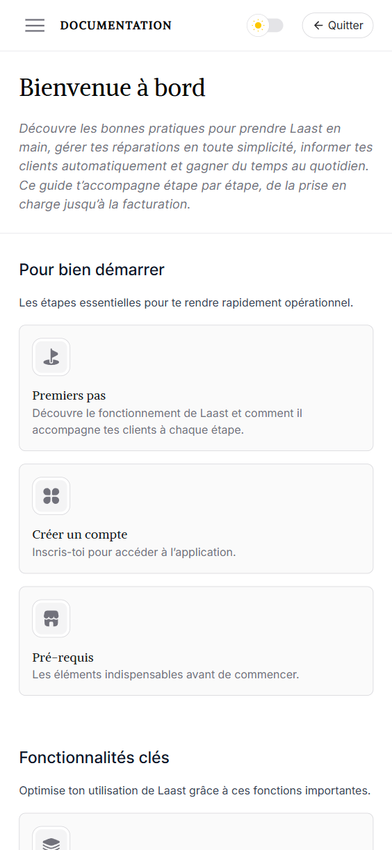
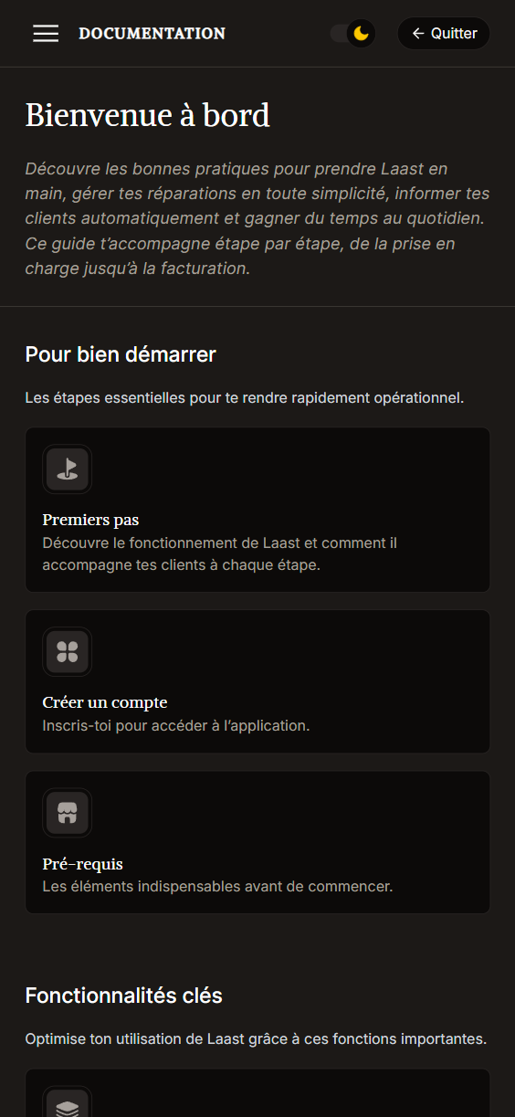
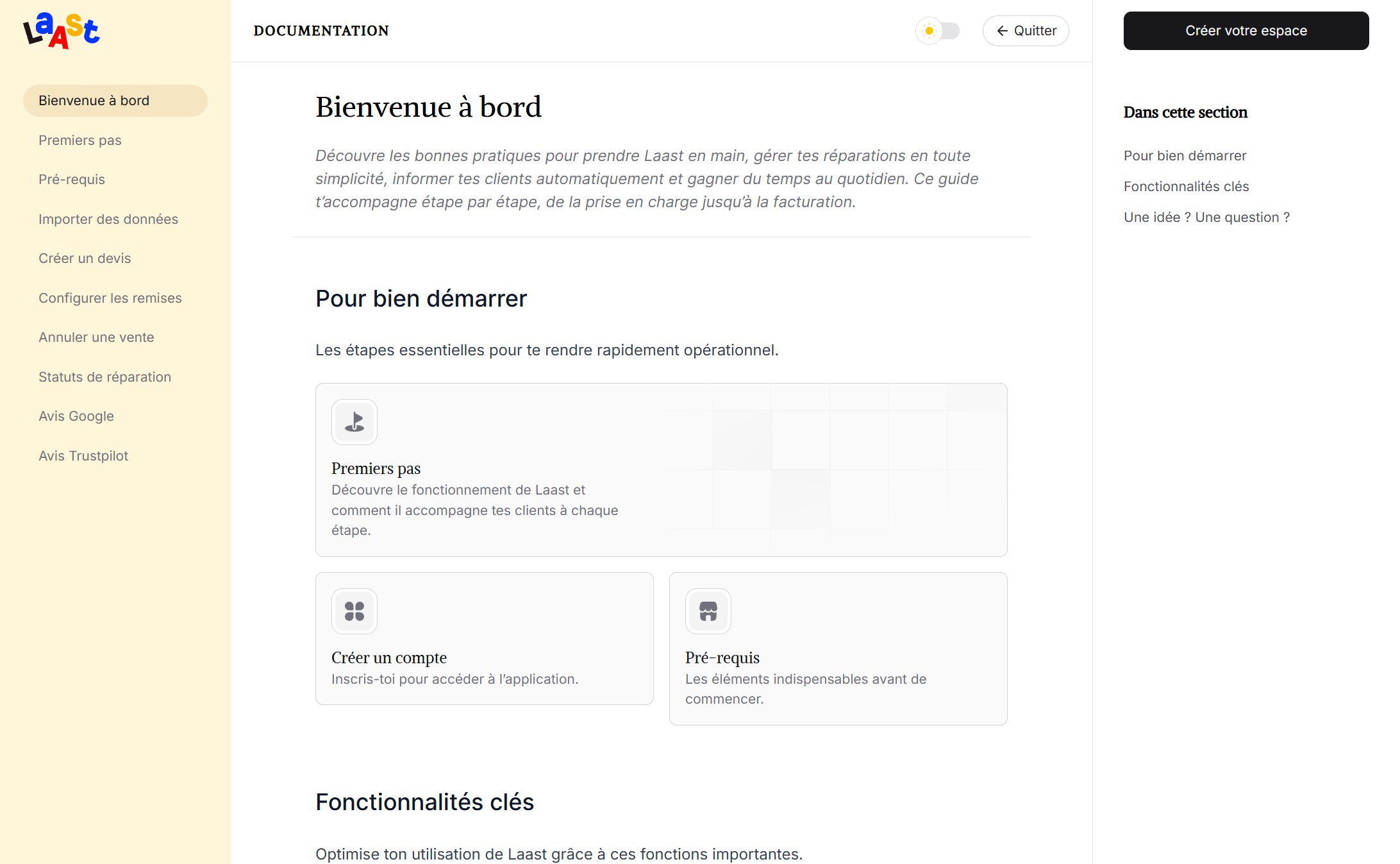
Designing the user guide
To drive conversions and increase trust, I suggested to build user guide / documentation section where all the basic actions and application settings would be covered. Targeted at new customers, this would not only help increase the product attractivity, but encourage indecise users to signup by ensuring them they will be properly supported.
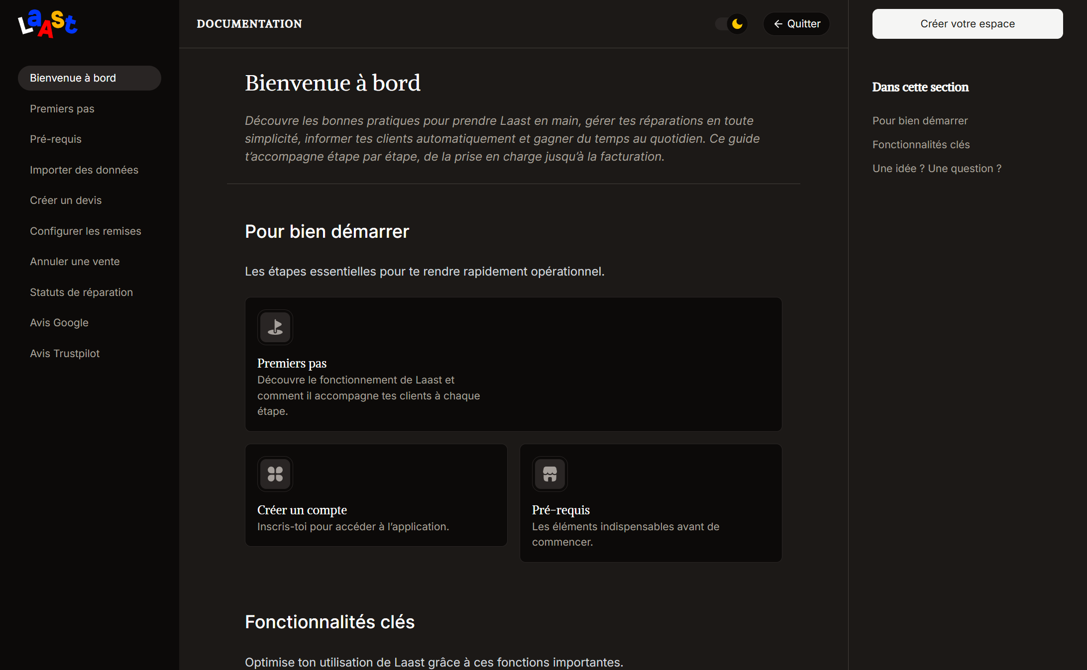
The user guide is built as a comprehensive resource.
The user guide implements its own layout, in the form of a software documentation. The content structure allows the guide administrator to use text elements, images, videos and icons to create a comprehensible user guide with a real impact on users, wether they are already subscribed or not.
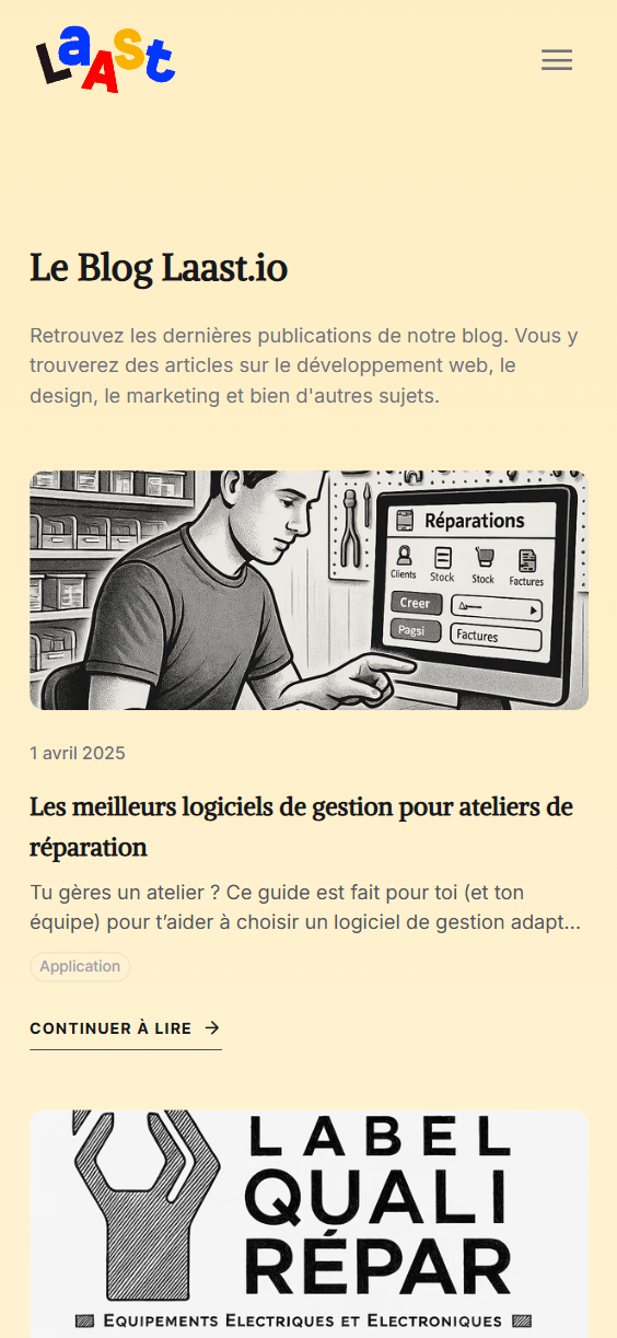
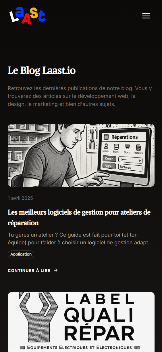
Handling the Blog
The client also expressed the desire to have a blog on his marketing website as he produces a lot of written and video content for his company and product, but doesn’t want to publish it on third-party platforms. That’s a debatable choice, but given the specific ultra nich aspect of the product, it could not hurt to have everything in the same place (given that the website itself is a completely separate application from the actual webapp).
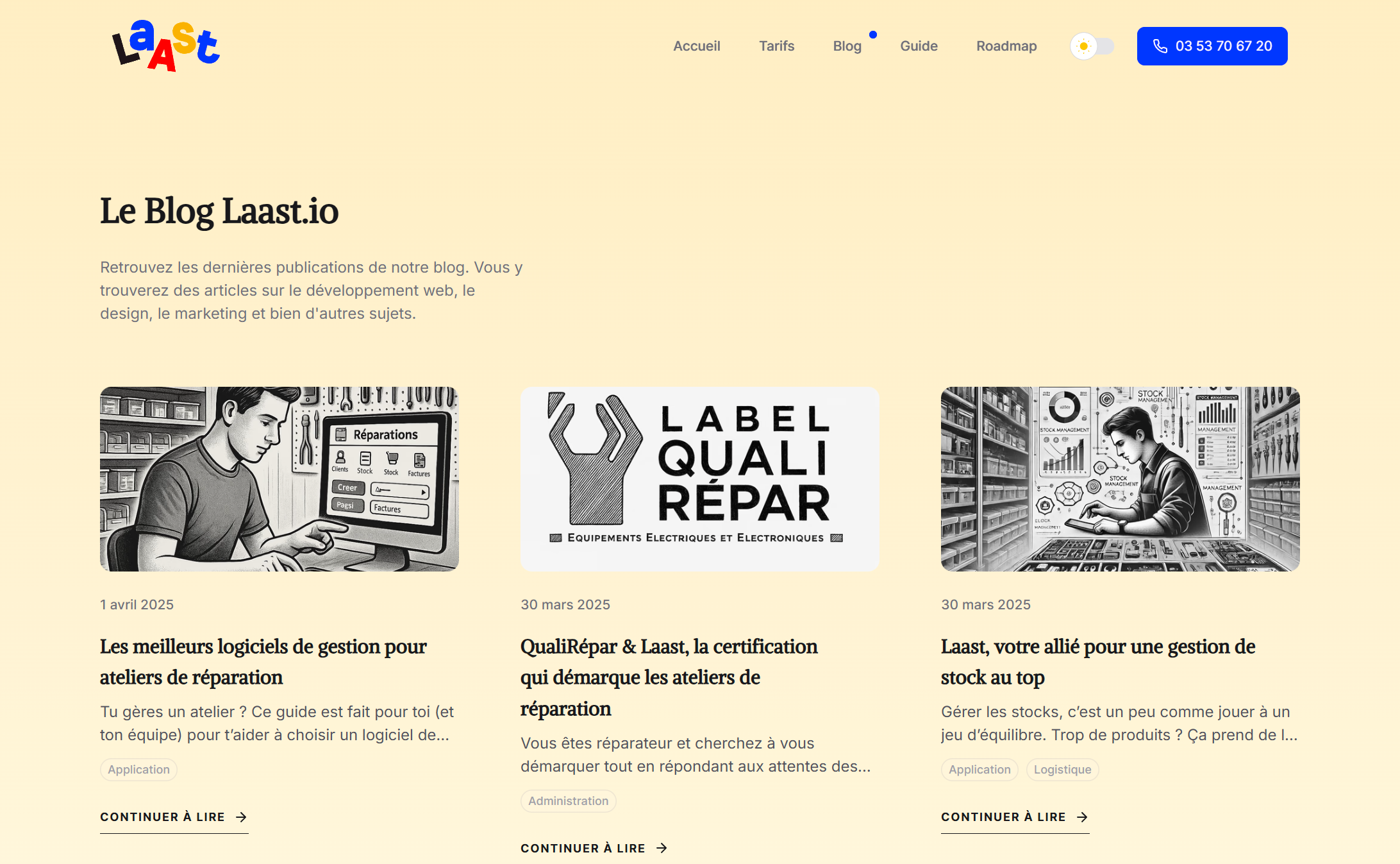
The blog is designed to be clean and easy to navigate.
While trying to be as readable as possible the blog articles page reuses the classical grid pattern to list the available articles, each article displaying a featured image, a title, an abstract, a publication date and some category tags.
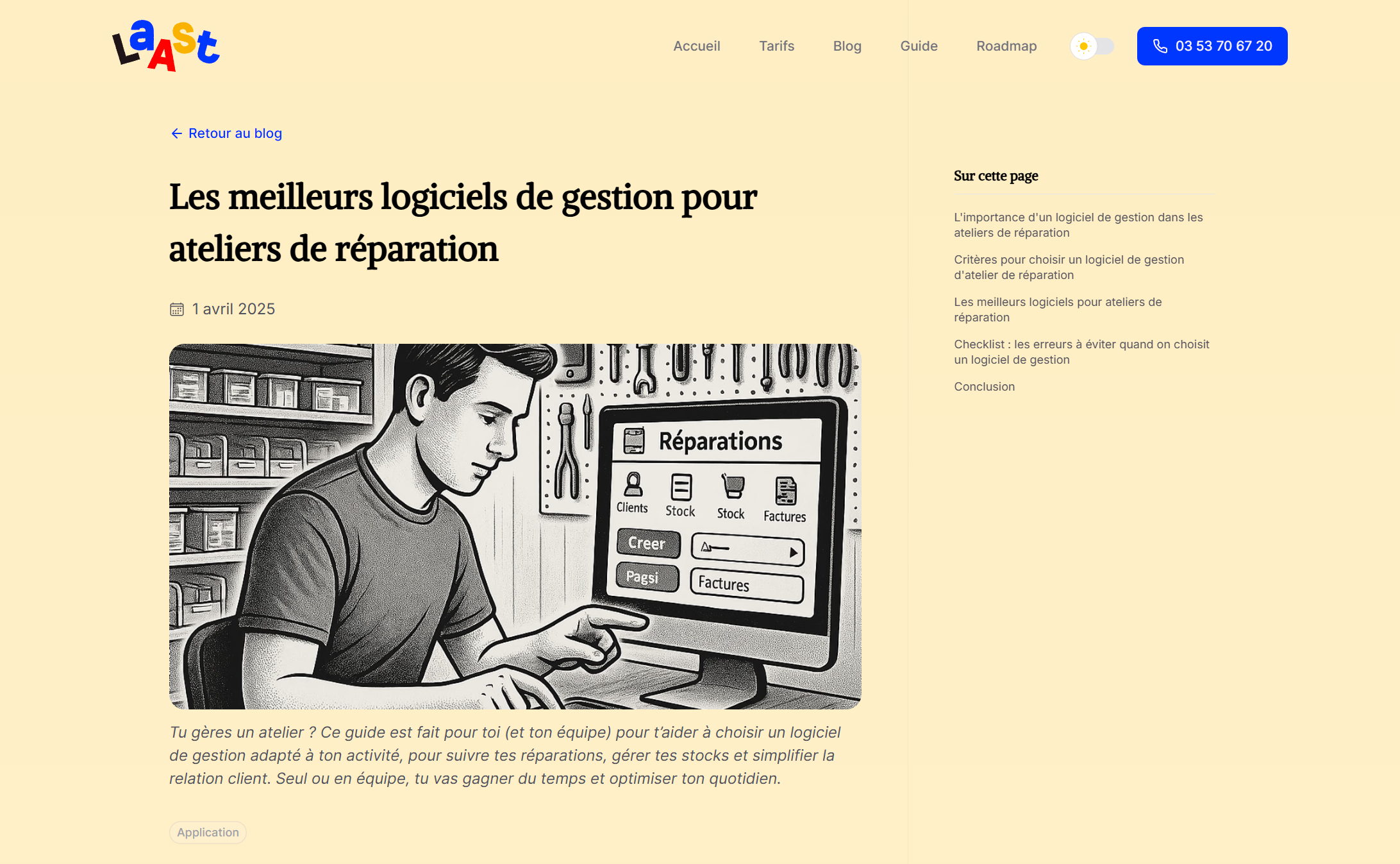
The article page remains minimalistic as well. The content is displayed on the left side while the right side holds a sticky table of contents that follows you when scrolling the article, making it easier to jump or return to sections you’d like to read again.
Key Takeaways
- Designing within brand constraints: Rebuilding the Laast.io marketing website required staying true to the brand’s playful and colorful identity while introducing new content and structure aimed at increasing conversions. Without using Figma mockups, the designer had to creatively iterate directly in code, striking a balance between budget constraints and visual fidelity. The brand’s personality needed to remain intact, even as the structure and messaging shifted to prioritize clarity, usability, and persuasive communication.
- Product-focused storytelling: Unlike the first version of the website, the redesign needed to strongly highlight the product’s features and benefits. This meant structuring the landing page around strategic content blocks: testimonials, onboarding flow, video demos, pricing, and a call to action. The goal wasn’t just aesthetic improvement—it was to guide reparators from curiosity to confidence, using design to reinforce the value proposition and drive conversions.
- Audience specificity: The site targets a very specific niche — repair shop owners. This meant tailoring both the tone and the functionality to a professional, goal-driven user base. Unlike broad consumer products, the site needed to speak directly to operational pain points and reassure users with credibility, simplicity, and domain expertise. Each design decision was filtered through this lens to ensure relevance and trustworthiness.
- Lean design process: The decision to skip traditional design handoffs (like Figma) in favor of direct code iterations reflects a lean, agile approach. It allowed for faster changes, more client involvement, and a flexible workflow. However, it also demanded clarity in communication and tight alignment between visual intent and technical implementation, especially since revisions were continuous and not spec-bound.
- Strategic content expansion: The addition of structured sections — like a detailed pricing page, user guide, FAQ, and blog — wasn’t just for SEO or completeness. These areas serve strategic roles: building trust, reducing churn, supporting onboarding, and reinforcing expertise. The content structure allows the company to educate, reassure, and convert visitors, especially those still evaluating the product.
- Custom user documentation: Creating a dedicated guide with multimedia content was a key move to support user confidence. By addressing setup, usage, and common questions in a standalone, styled section, the site helps potential and existing users feel supported and self-sufficient — critical in a niche where onboarding challenges can be a barrier to conversion.
Before and after
I wish I could expand more on this project as there are so much more interesting focus points that diserve a highlight, but I think this already gave you a solid overview of the project and some of the problems that were solved. I hope you enjoyed reading about this passionate journey!
Project tools
 nuxt
nuxt tailwindcss
 figma
figma
Project Info
- Type:Marketing Website
- Industry:Retail
- Duration:1 month
- Completed in:2024
Let's build something amazing together!
Whether you have a project in mind or just a rough concept, let's connect and explore how we can bring your ideas to life.