I designed and created Shuriken UI — a UI library with 50+ reusable components
Shuriken UI is an open-source UI library that provides a set of high-quality components for building modern web applications. It is designed to work seamlessly with Nuxt and Tailwind v4.
The vision behind shuriken UI
Shuriken UI was born out of a clear and recurring frustration: at that time for me, most UI libraries either felt too rigid or too bloated for product development. As someone who balances product thinking, front-end UI, and UI/UX design, I often found myself in one of two situations—either forced to override brittle styles or endlessly stitching components together to form a usable baseline. Neither was ideal.
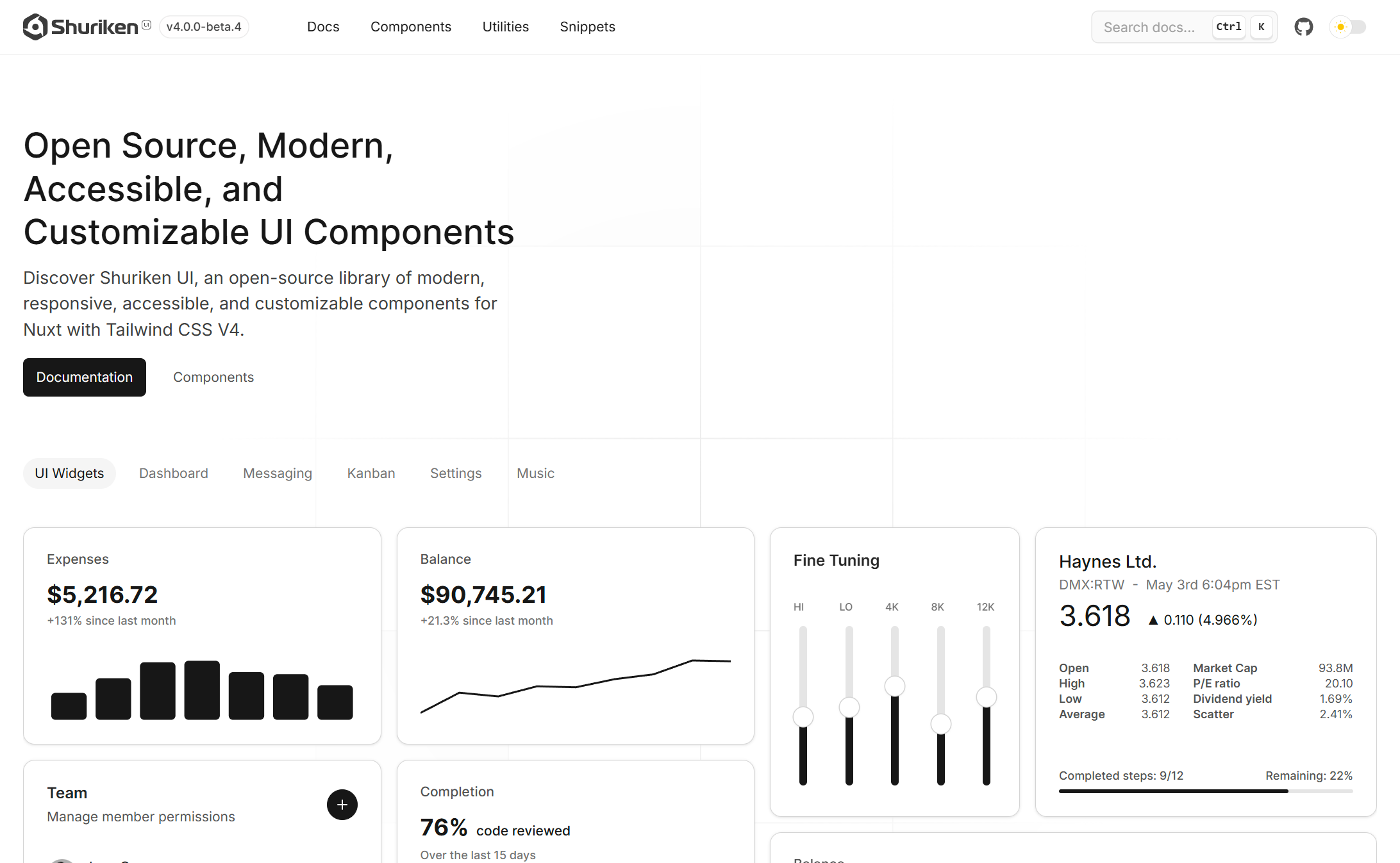
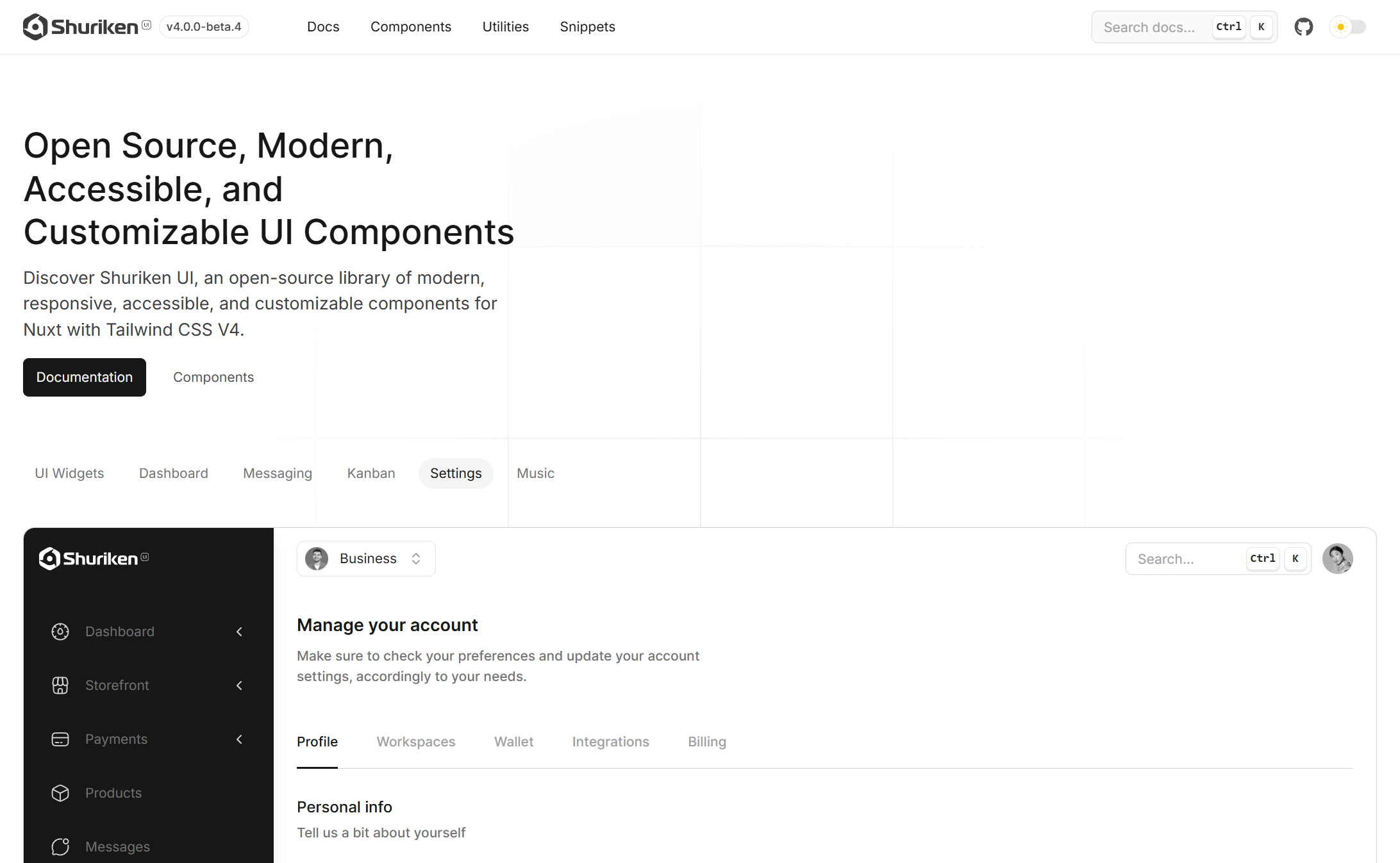
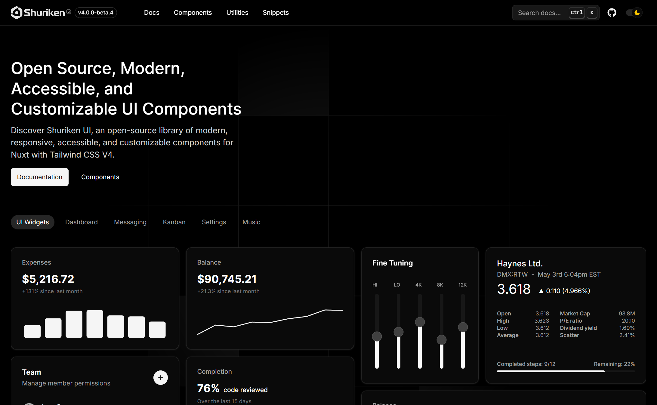
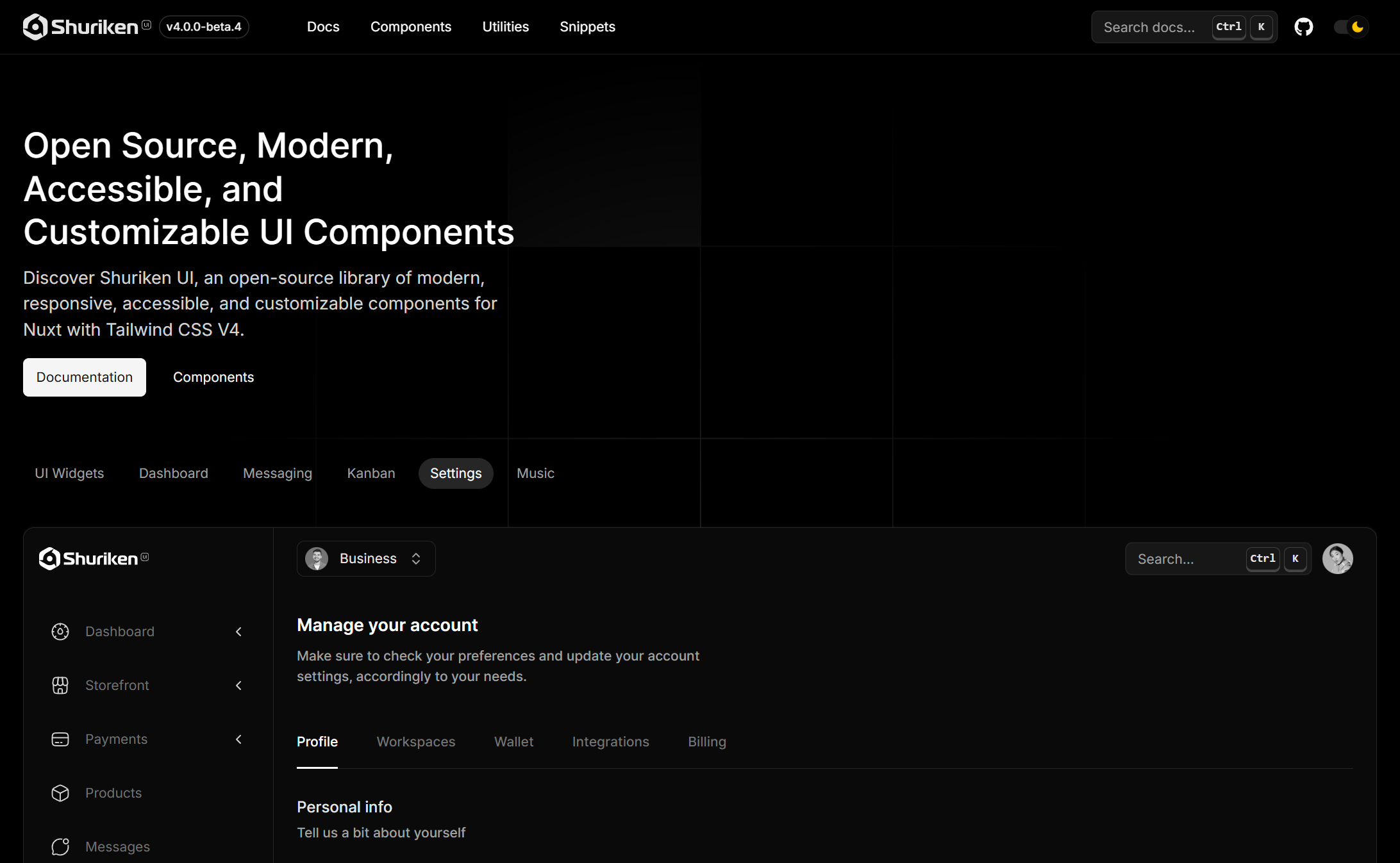
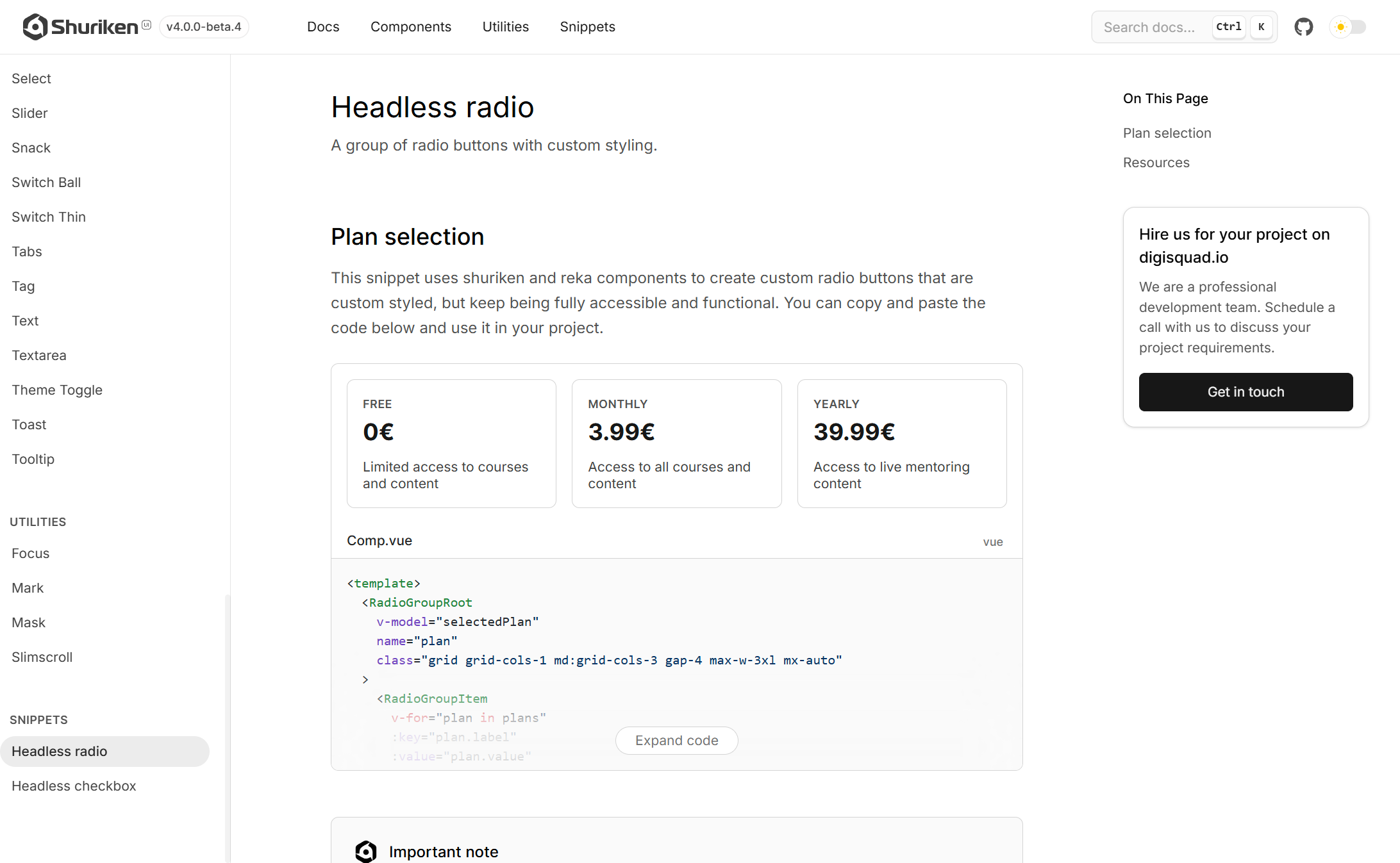
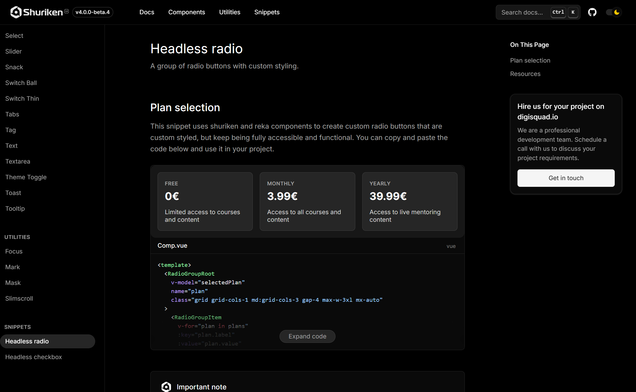
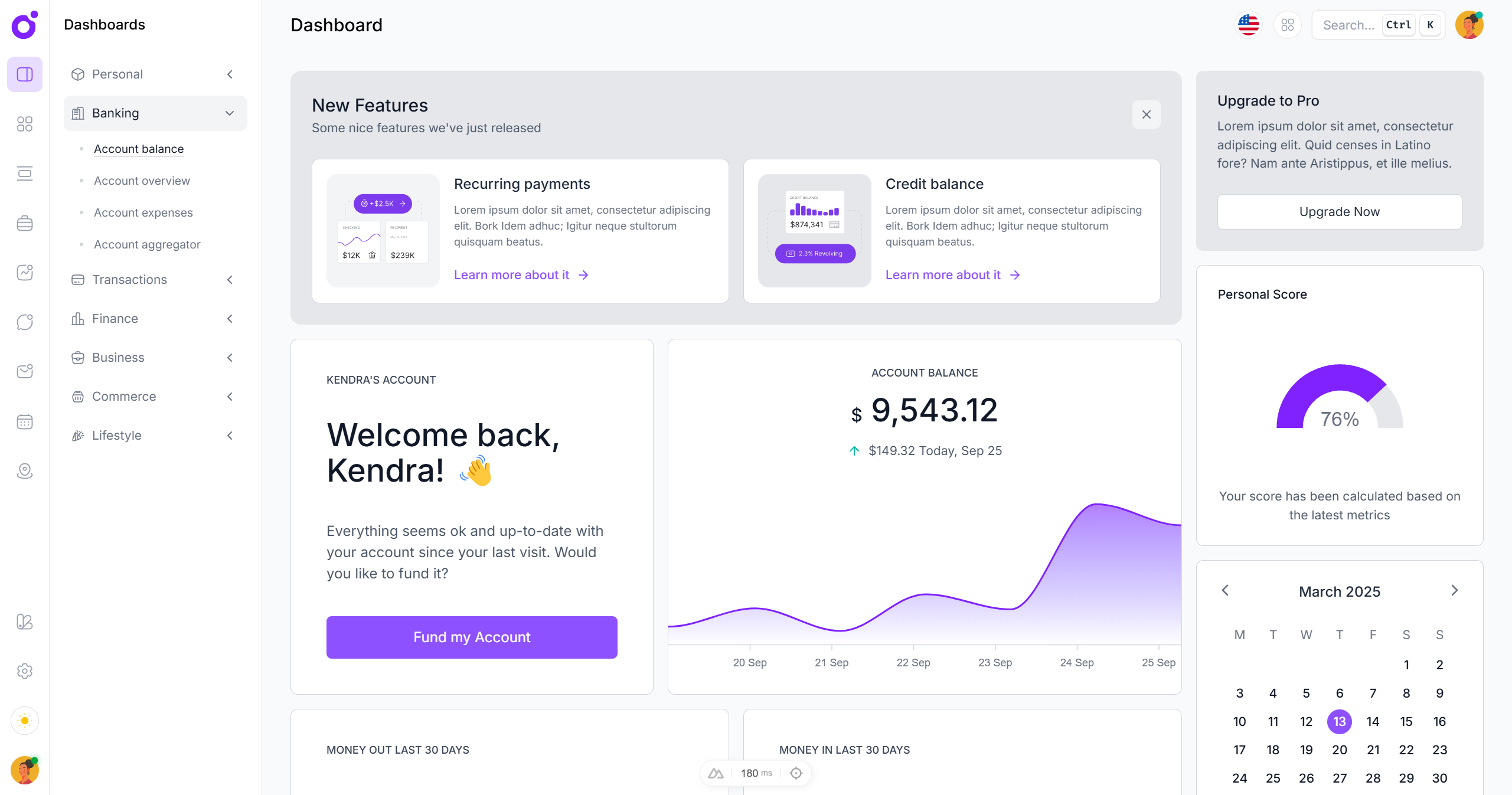
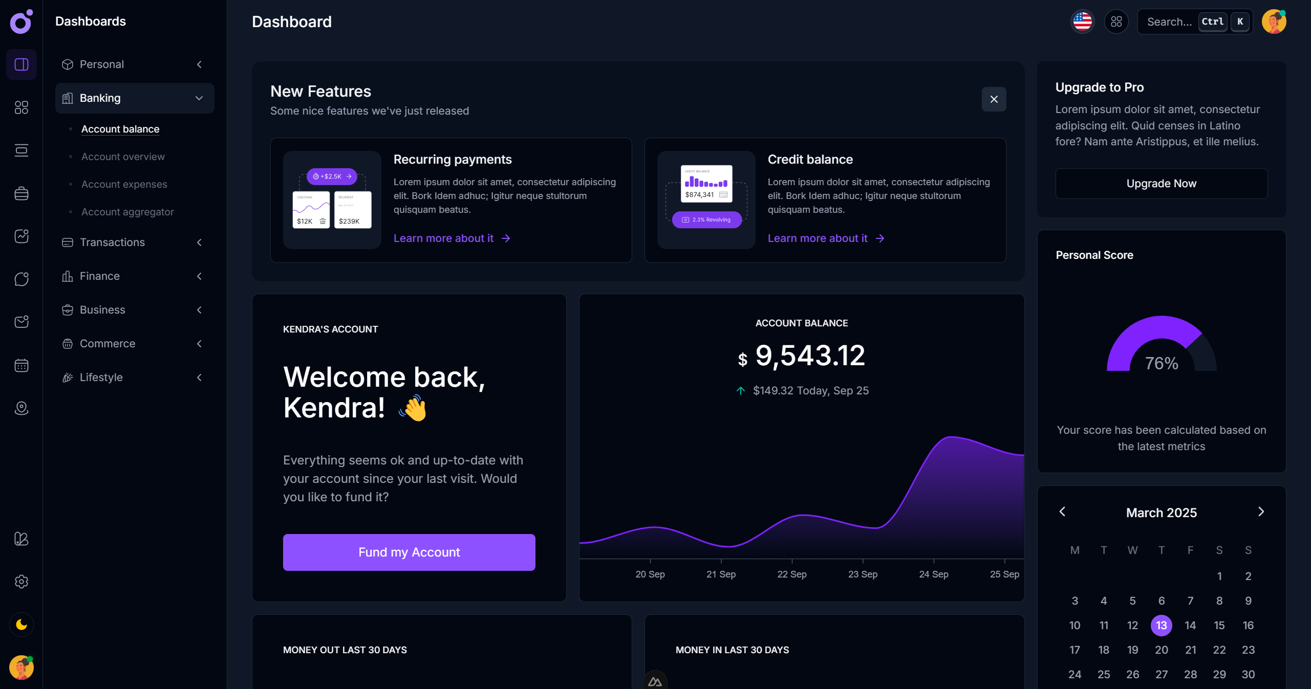
Shuriken UI documentation.
With Shuriken UI, the goal was not just to create another component kit, but to build a developer-friendly, designer-minded interface system that would solve real problems at the intersection of code and design. It needed to be fast, customizable, accessible, and look good out of the box — without locking users into arbitrary patterns.
Designing for developers who care about design
Unlike libraries that prioritize visual polish at the expense of flexibility, or developer tools that look like they came out of 2012, Shuriken UI was designed with a nuanced duality: it had to serve both rapid prototyping needs and long-term scalability, for what was going to be only for internal usage, at least at first. Tailwind CSS provided a solid utility-first backbone, while the design system layered thoughtful decisions about spacing, layout consistency, typography, and motion on top.
Shuriken UI is its own design system.
This philosophy extended to every component, from the most basic <BaseButton /> to more advanced patterns like cards, dropdowns, popovers, autocompletes, or inputs. These components weren’t just UI wrappers — they represented real-world usage scenarios and could be adapted cleanly across product types, from dashboards to admin panels, CMS tools, and public sites.
Built for Nuxt, with native feel
Shuriken UI was tailored for Nuxt from the start, with an objectif in mind to release it for Vue as well. While it remains framework-agnostic in its visual and behavioral logic, the Nuxt-first approach allowed for better handling of hydration, transitions, SSR, and theming.
It integrates seamlessly into Nuxt applications, including features like:
- Supports RTL, and custom breakpoints
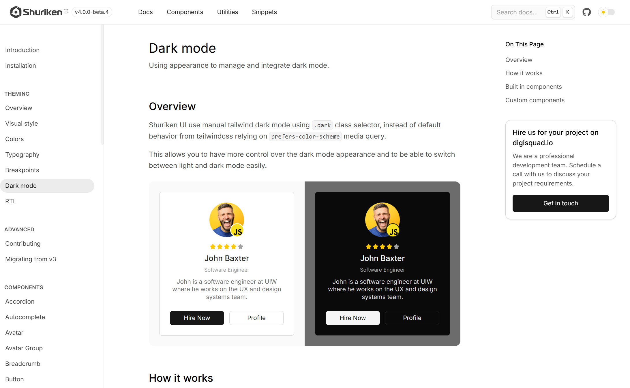
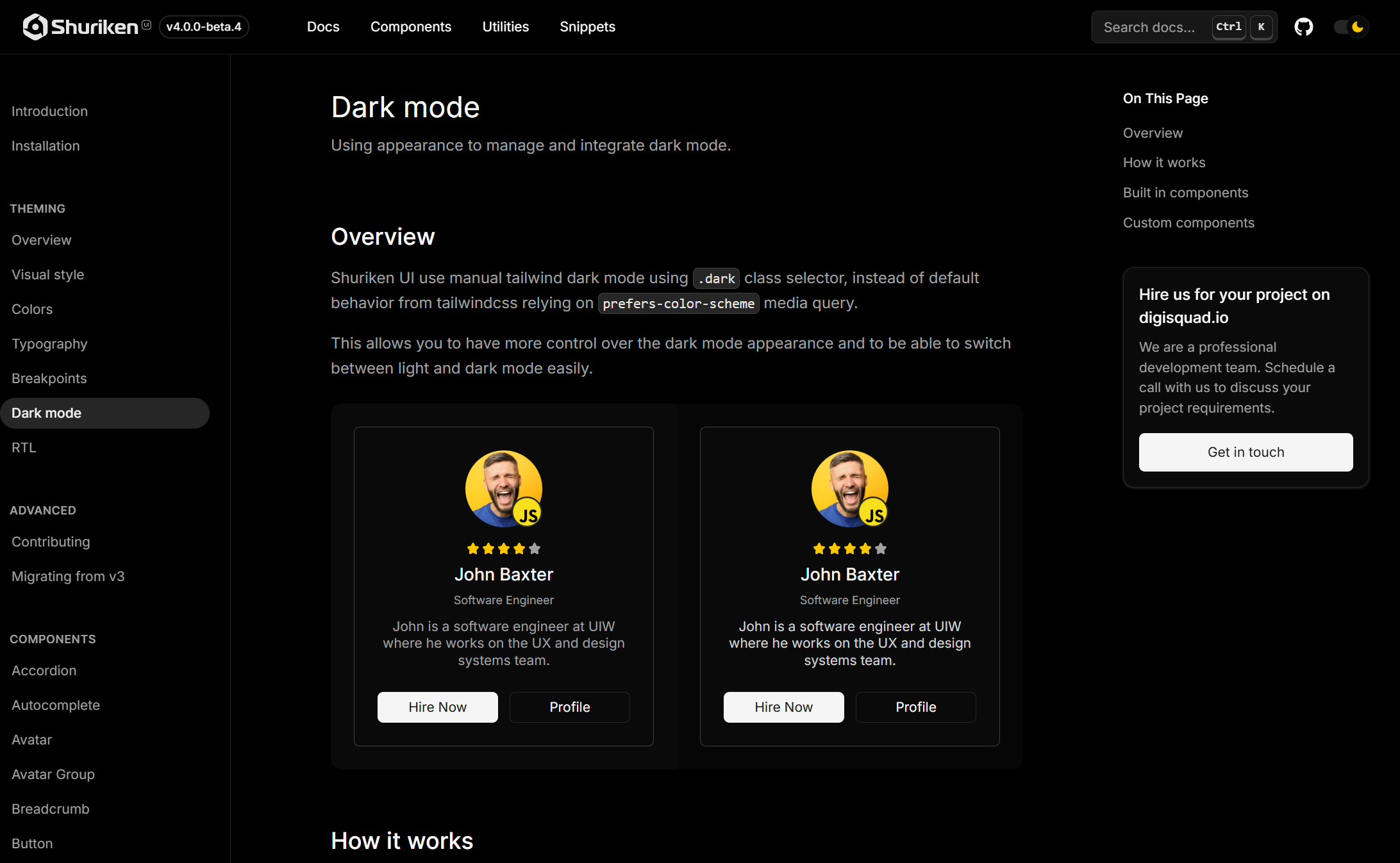
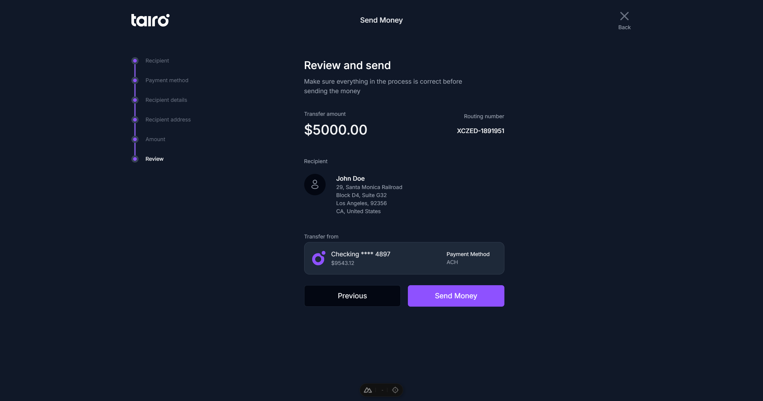
- Implements theme switching, built on top of Nuxt Color Mode
- Fully customizable through design tokens
- Supports for Nuxt app transitions
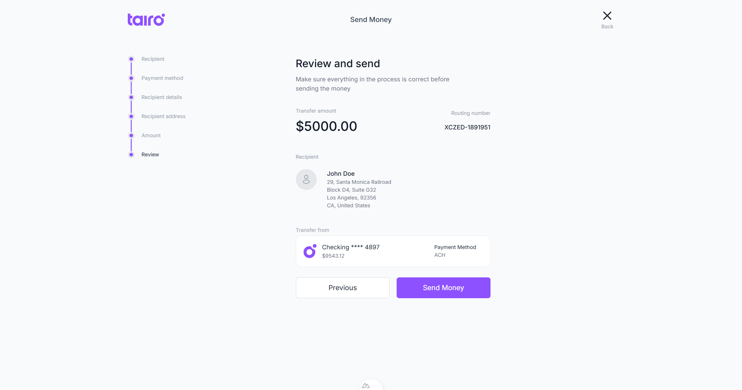
Shuriken UI provides crispy components.
Shuriken UI doesn’t force a layout or design paradigm on designers and developers — it helps them build their own confidently.
Solving common design-to-code frustrations
One of the biggest pain points in component libraries is the handoff between design and implementation. Shuriken UI addresses this by being visually consistent, functionally predictable, and extremely well documented. Each component ships with clear API descriptions, accessibility notes, and usage examples that can be copied and pasted without surprises.
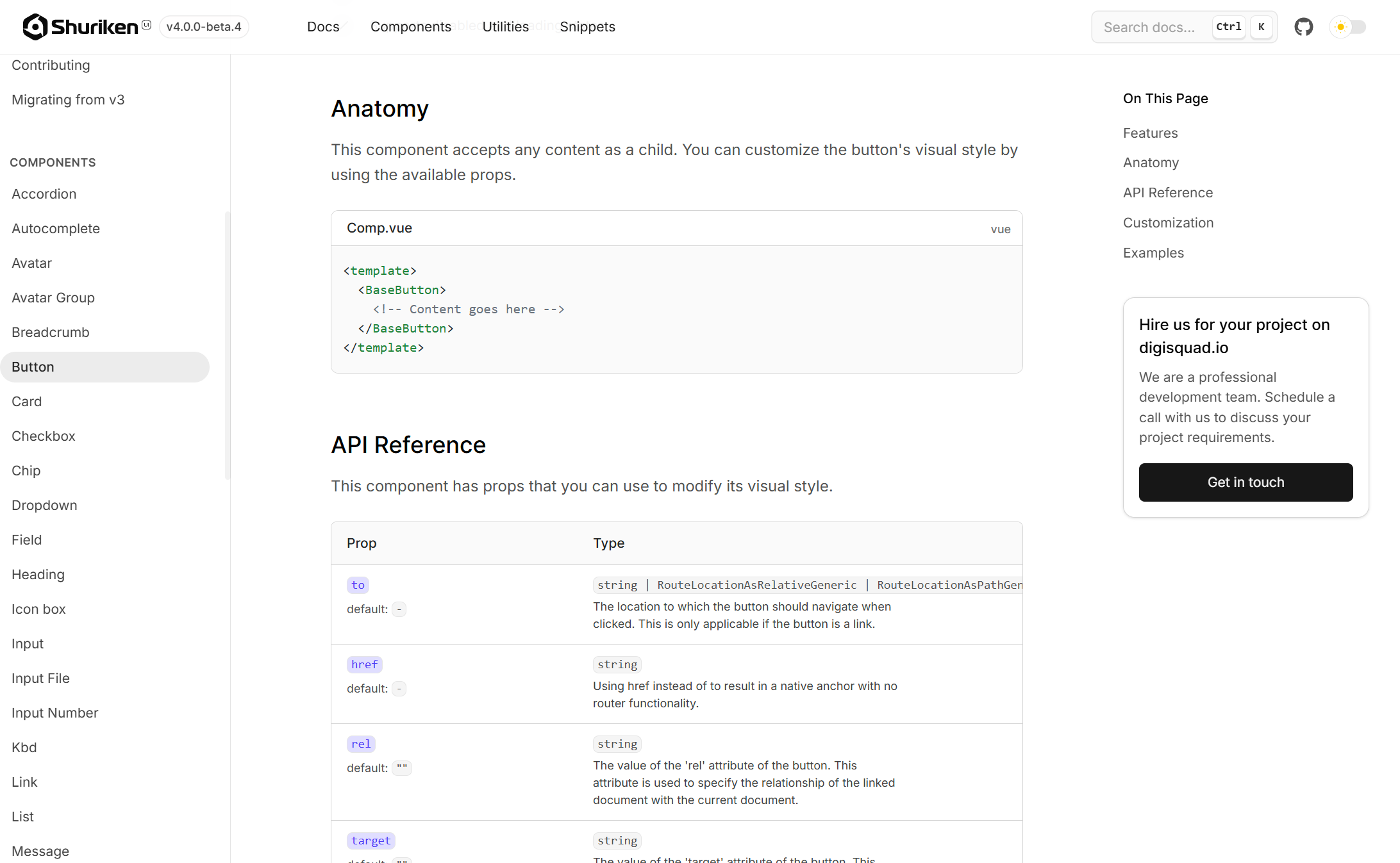
Each component ships with clear API descriptions.
More importantly, the theming system allows developers to visually align components with their brand quickly — without diving into low-level CSS overrides.
Whether it’s customizing font families, switching themes, adapting spacing, or creating adaptive breakpoints, Shuriken’s design tokens are consistent and clear, making it easy to maintain large-scale interfaces over time.
Production-ready out of the box
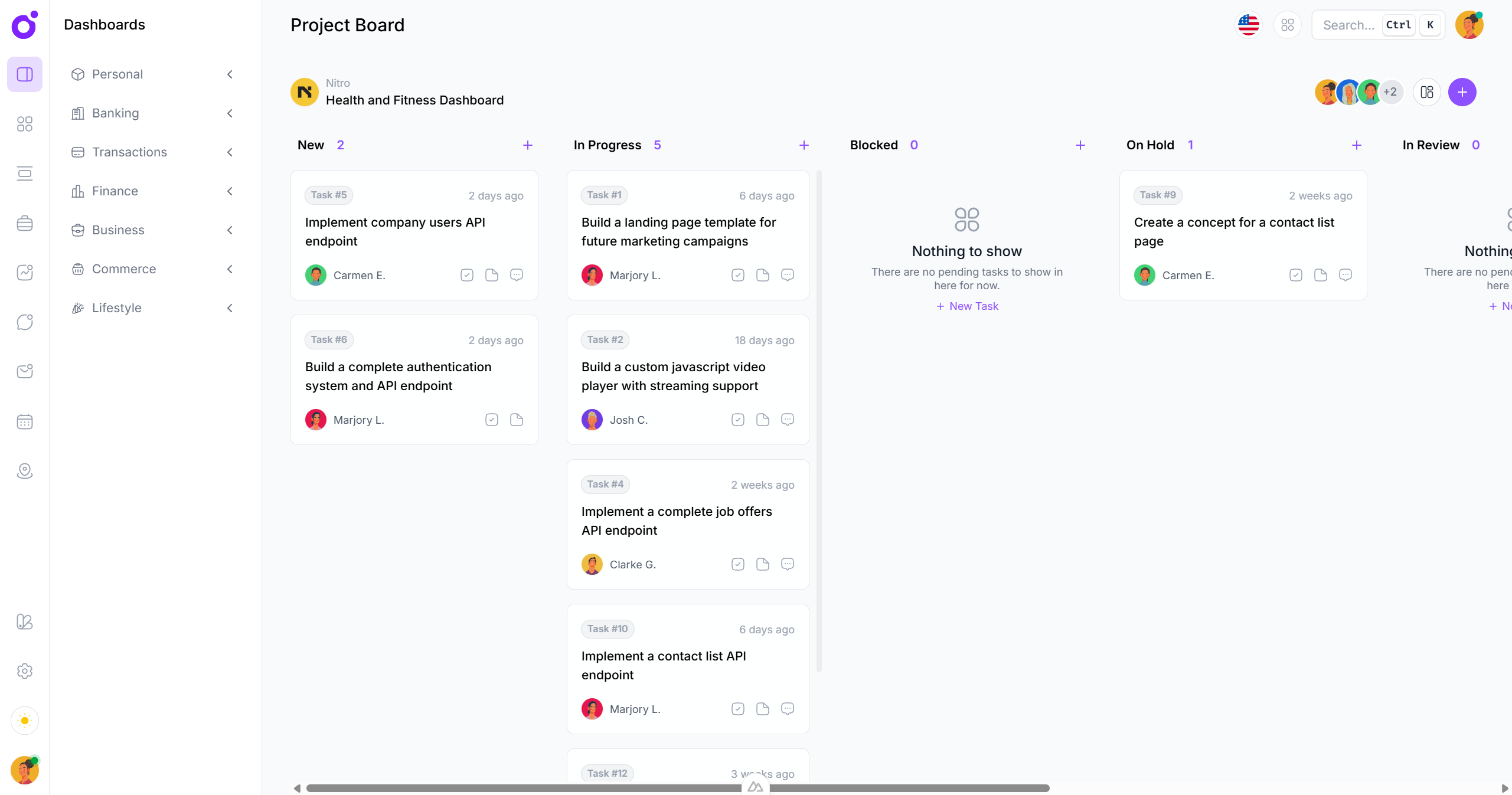
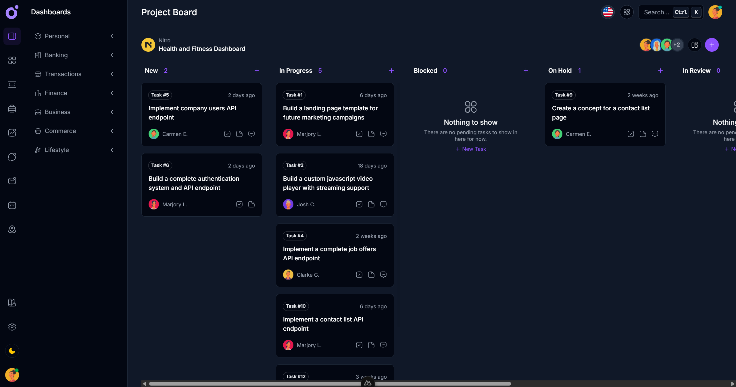
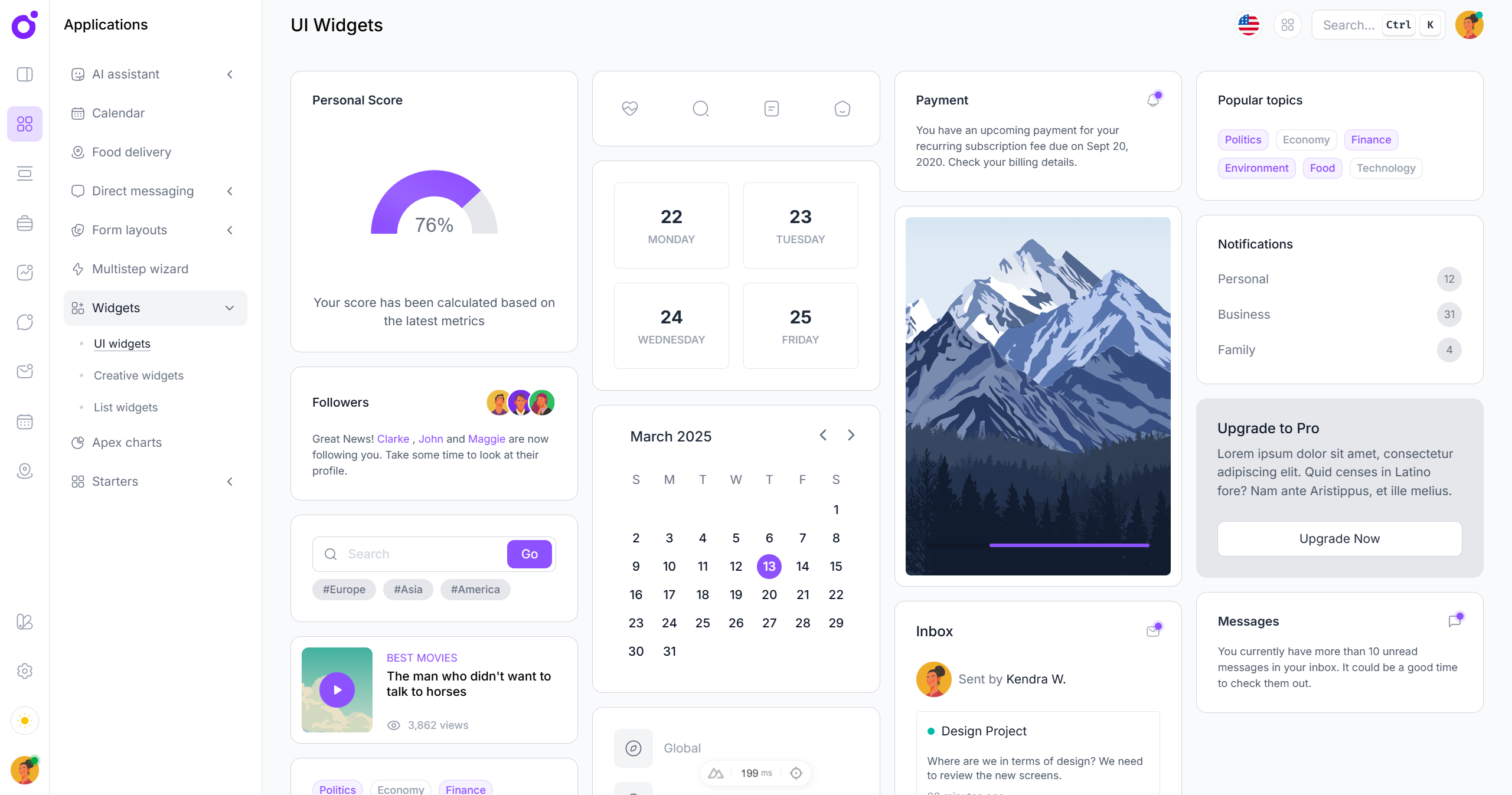
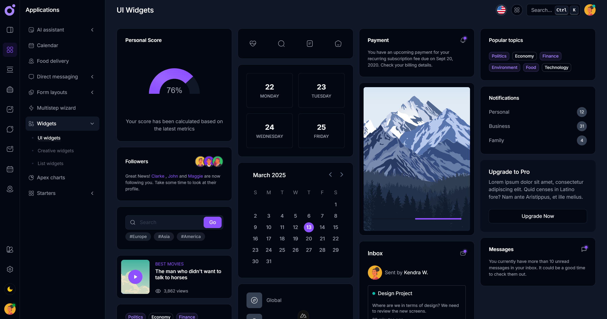
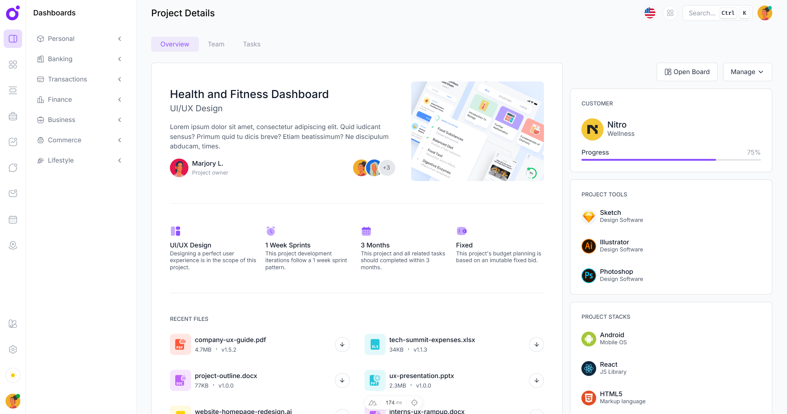
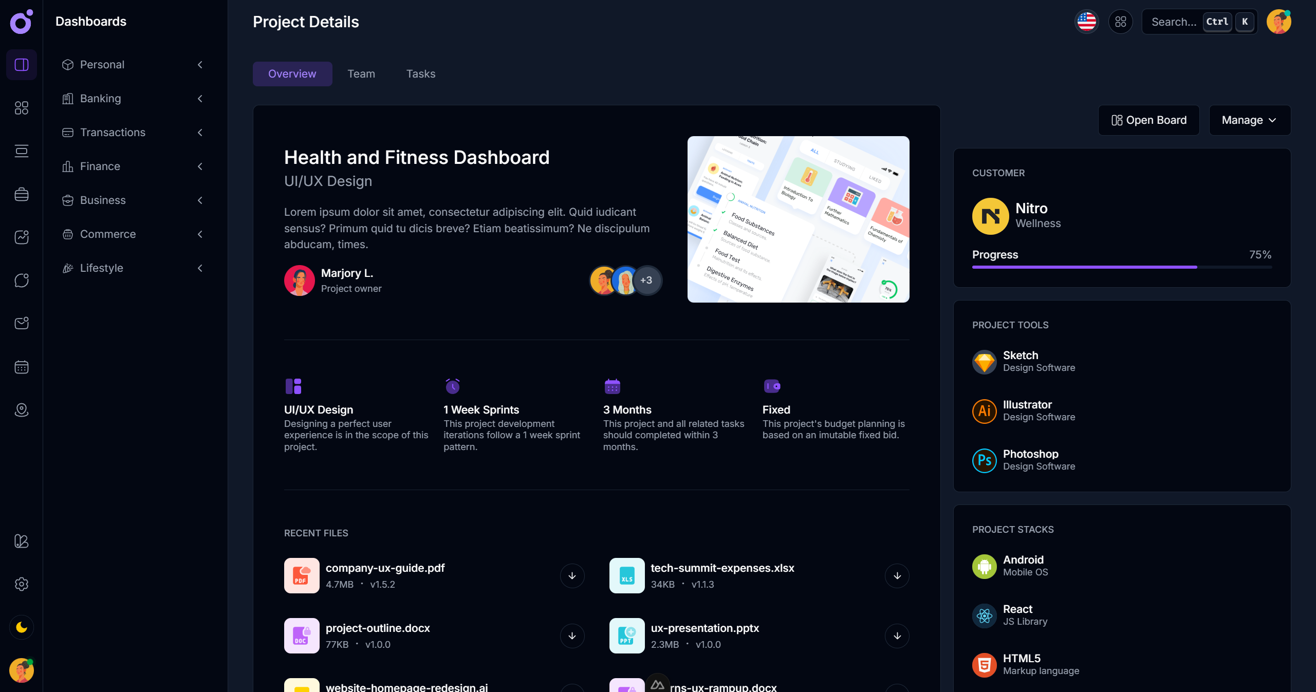
Every decision made in Shuriken UI was stress-tested through real usage. The most visible example of this is Tairo, a full Nuxt 3 template built using Shuriken UI. Tairo is more than just a demo — it’s a production-grade app skeleton that includes a working authentication flow, dashboard interface, notifications, multi-language support, and more.
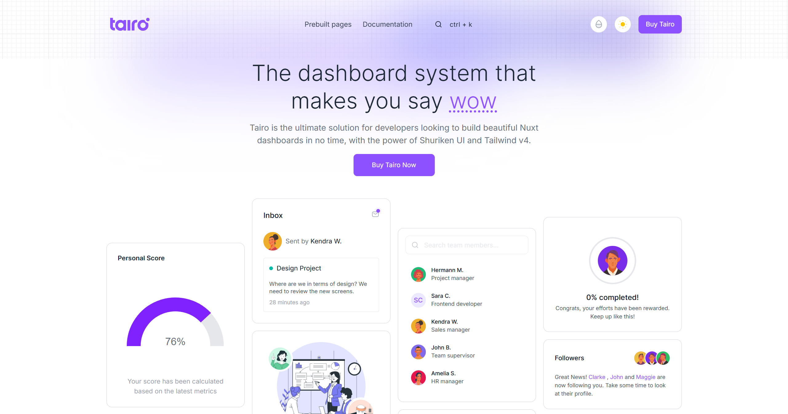
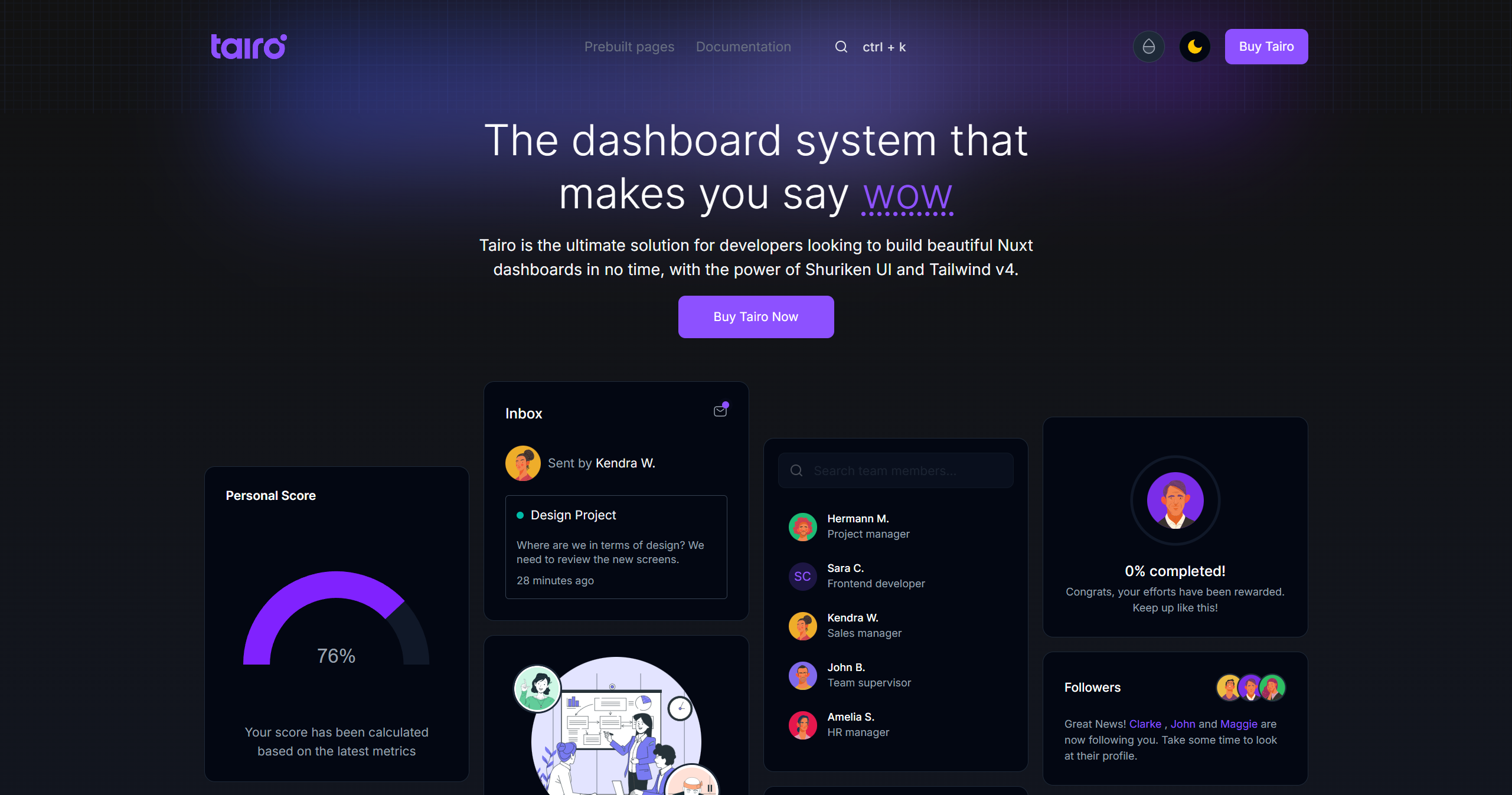
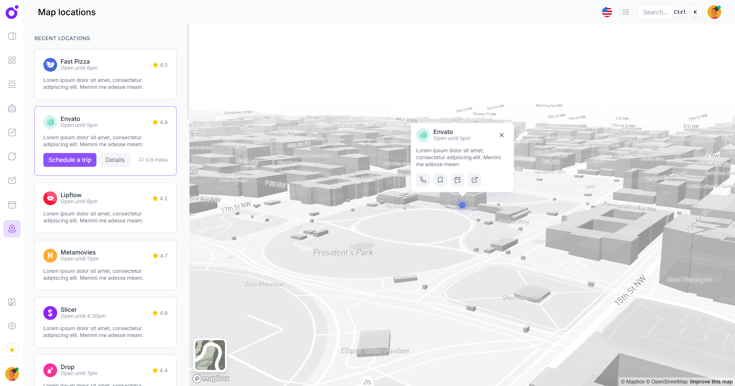
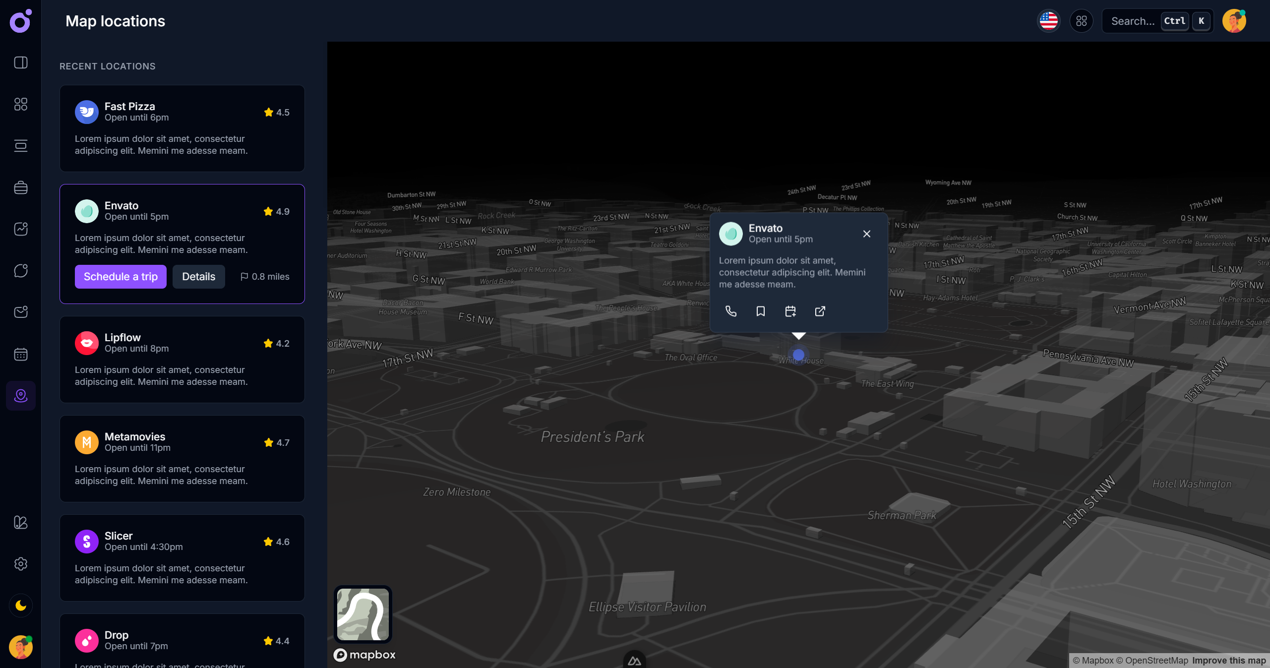
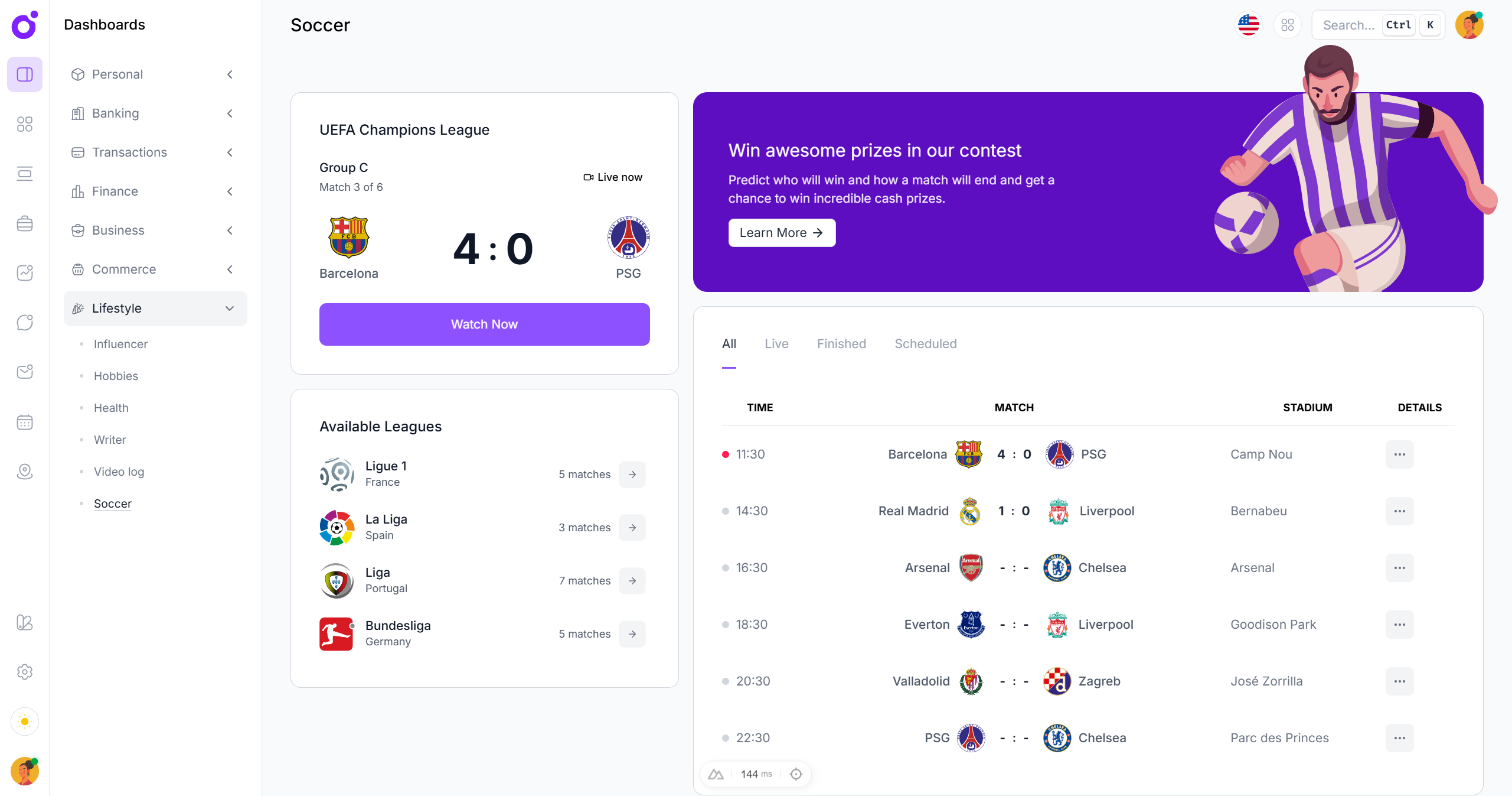
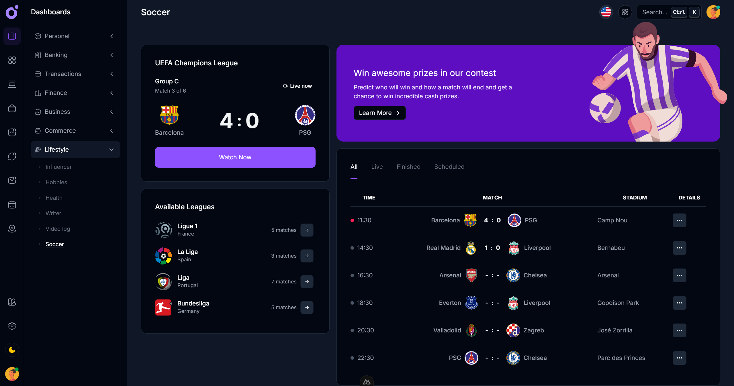
Tairo is a full Nuxt 3 template built using Shuriken UI.
This proved invaluable in shaping Shuriken’s architecture. Building Tairo using Shuriken allowed real-world UI decisions to influence the component system itself. If something didn’t work well under real constraints (like dynamic layouts or asynchronous data), it was improved — or rewritten entirely.
Tairo is a full Nuxt 3 template built using Shuriken UI.
Tairo also serves as proof that you can go from idea to launch-ready product with Shuriken UI without writing your own UI layer from scratch.
Evolving the library with the community
Shuriken UI is also meant to be approachable and extensible for teams. Through its documentation, contribution guides, and modular structure, it's open to input and structured in a way that makes community collaboration meaningful.
Whether you're a solo maker, a startup developer, or part of a larger team, you can customize and extend components without "fighting the library". With full support for:
- Component variants
- Custom themes
- Utility-first overrides
- Type-safe props and composables
Key takeaways
- Purpose-built for Nuxt: Shuriken UI is designed specifically for Nuxt, offering SSR-ready, transition-aware components that plug into Nuxt projects naturally.
- Bridges design and code: The system solves design-to-code handoff issues with clean tokens, consistent spacing, and intuitive theming, reducing the gap between mockups and production.
- Real-world proven: The companion product Tairo demonstrates Shuriken UI’s maturity and readiness for production, showing how quickly it can be adapted into full-scale products.
- Highly customizable: Developers can modify visuals, behavior, and theming through a modern, Tailwind-first design system—without overriding messy CSS.
- Fully accessible: Every component was built with accessibility in mind, ensuring that Shuriken UI can serve as the foundation for inclusive web applications.
- Beautiful and practical: Unlike many headless or utility-only kits, Shuriken balances aesthetic consistency with developer ergonomics, offering a refined look that’s easy to extend.
Before and after
I wish I could expand more on this project as there are so much more interesting focus points that diserve a highlight, but I think this already gave you a solid overview of the project and some of the problems that were solved. I hope you enjoyed reading about this passionate journey!
Project tools
 vue
vue nuxt
nuxt tailwindcss
 storybook
Project Info
- Type:UI Library
- Industry:Software Development
- Duration:3 years
- Completed in:2025
Let's build something amazing together!
Whether you have a project in mind or just a rough concept, let's connect and explore how we can bring your ideas to life.